Project Origins
This project was inspired by Steph de Silva’s UseR! 2018 Keynote.
Beyond Syntax: the power and potentiality of open source communities
With this keynote as a loose inspiration, I wanted to create a data-driven representation of the community to try and see what I could learn from the data. Initially I had wanted to include data from many sources including Twitter, mailing lists, GitHub repos, meetup attendance, conference attendance and organisational affiliation. Ultimately the first data source I chose (Twitter) ended up being far more insight-rich than I had expected, and the data was also significantly harder to extract than I had planned for; in the end the project focused solely on the use of Twitter data.
I had originally hoped to use this Twitter dataset to understand and describe the shape of the R community, and observe:
- changes in the shape of the community over time
- different approaches for newcomers looking to engage with the community
- topics that the community is excited about
- where the community is seeing the most growth
I realised this was also too much of a stretch for a project which was bound to the timeframe of a single university semester - the Twitter API rate limits made it impossible to get enough data to analyse these time-based questions.
With these limitations in mind I had to reset my expectations for the project. The revised objectives were:
- Identify structure inherent in the network to create a “town map” for the R community
- Use a data-driven approach to help newcomers identify who to follow in the R Twitter community
- Identify whether there was evidence to support Steph’s assertion that the R
sub-culture is really made up of several independent but connected
communities
The intended audience for this project is the R Community itself, with Steph taking the role of my “client” (on behalf of the community) for the purpose of the formal university assessment.
The UTS assessment criteria required regular blogging as part of the project, and these blog posts are all available via the R Community tag. In the project summary below, I will summarise each of these blog posts as an overview of the work completed and the findings uncovered.
Identifying Techniques
At the start of the project I knew I was going to have to collect Twitter data and work with graph objects. Given the nature of the project, the only appropriate way to kick off the research was to ask the #rstats community on Twitter:
Hey #rstats I'm about to start work on a big social network analysis project with @StephdeSilva (following from her keynote at #user2018 we're mapping the R community!) and I'd love it if anyone had any tips, blog posts, package recommendations.
— Perry Stephenson (@perrystephenson) July 19, 2018
I got some really helpful responses from the community, and I wrote my first blog post about all of the different avenues for research that I had received from the community. Whilst I didn’t get around to reading everything (there are only so many hours in the day!) I did get a huge amount of value out of these resources:
- 21 Recipes for Mining Twitter Data with rtweet by Bob Rudis
- Tidygraph and ggraph presentation from rstudio::conf 2018 by Thomas Lin Pedersen
- DataCamp: Network Analysis in R
- DataCamp: Network Science in R - A Tidy Approch
Steel Thread
I wanted to start playing with real data as soon as possible, so I jumped straight into the API and pulled a week of data from the #rstats hashtag. I then followed the instructions from Bob Rudis’ 21 Recipes for Mining Twitter Data with retweet to stick the data into a graph (using igraph), then used ggraph to plot the retweet relationships.
All of the code for this initial example is written up in my first real blog post for the project - Mapping the #rstats Twitter Community. With the steel thread complete, I set about trying to get some more substantial datasets in order to respond to my project objectives in a way that generalises beyond the past seven days.
Collecting Data
The two biggest challenges for the entire project were getting enough data, and then getting the right data. To really make the project worthwhile I wanted to try and collect all R tweets since the launch of the Twitter service in 2006. I quickly identified four options for getting the data:
- Pay Twitter for an enterprise account with API access to the full Twitter history
- Pay a third-party (who already has enterprise API access with Twitter) to extract the data
- Creatively reconstruct the timeline by crawling from known participants
- Screen scape like I’ve never screen scraped before
I explored these options in detail in the Retrieving Bulk Twitter Data blog post, and concluded that the only viable option was to use a web scraper. I found a suitable tool in the form of the twitterscraper Python package which let me collect 12 years of Twitter data across 24 different hashtags, and was able to complete the extraction overnight.
Ethical Considerations
On the surface it looks like I might have stepped on an ethical landmine by using a scraper, as the use of scrapers falls foul of Twitter’s Terms of Service:
… scraping the Services without the prior consent of Twitter is expressly prohibited
This was actually drawn to my attention by several issues raised against the twitterscraper GitHub repo (see issues #60, #110 and #112).
As an Australian it is unclear whether this is covered by any relevant legislation, but even in the United States and the European Union there isn’t much in the way of guidance on this issue. I reviewed a few cases in a blog post Is it okay to scrape Twitter? and following a fairly thorough ethical assessment I concluded that it was an acceptable way for me to collect data for this project.
Initial Analysis
After a quick check to make sure that I collected enough data I started pulling apart the dataset to find some initial insights. I realised I was probably the only person to have ever compiled such a dataset, so even basic insights were likely to be novel and interesting to the community. I was clearly right, because my Analysing the R Twitterverse blog post became the most engaging tweet of my Twitter career.
This tweet gave me some excellent engagement statistics!
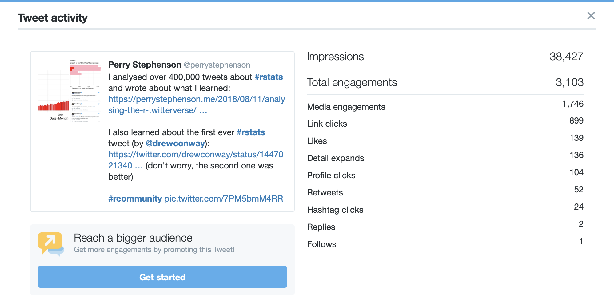
If nothing else, this helped confirm that the intended audience for the project (the R community) were interested in what I was trying to do!
Connected Communities
A core observation in Steph’s keynote from UseR2018! was that the R sub-culture was made up of many smaller connected communities. In the Twitter dataset I expected to see these communities emerge as hashtags, so I went about analysing the hashtag co-occurrence network to explore how communities are connected.
By building a force-directed graph (using the particles package) I was able to produce something of a “town map” for the R communities that use Twitter:
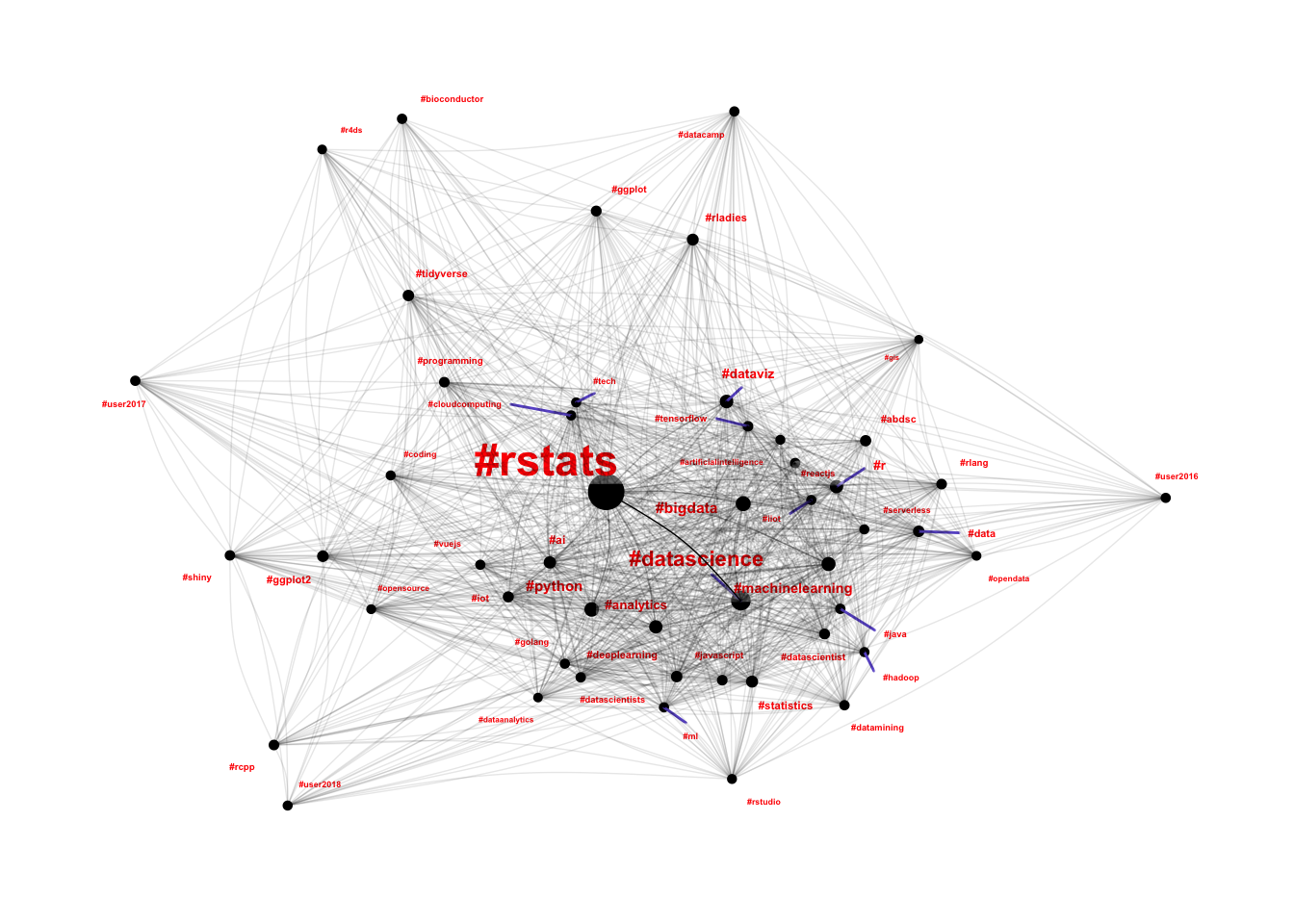
This was a fantastic outcome, because it helped me achieve all three of the key objectives for this project:
- It used the structure inherent in the dataset to create a “town map”
- It is immediately useful for new community members, because it provides an overview of the connected communities that they can join
- It helped to support Steph’s assertions about the R sub-culture being made
up of many smaller connected communities.
Beyond the network analysis, I also used signal analysis techniques to analyse the time-series data for each hashtag (tweets per hour) to build a number of features, then used clustering techniques to analyse how different communities display different patterns of engagement. This was covered extensively in my Community Engagement Through Hashtags blog post which identified a number of interesting community clusters:
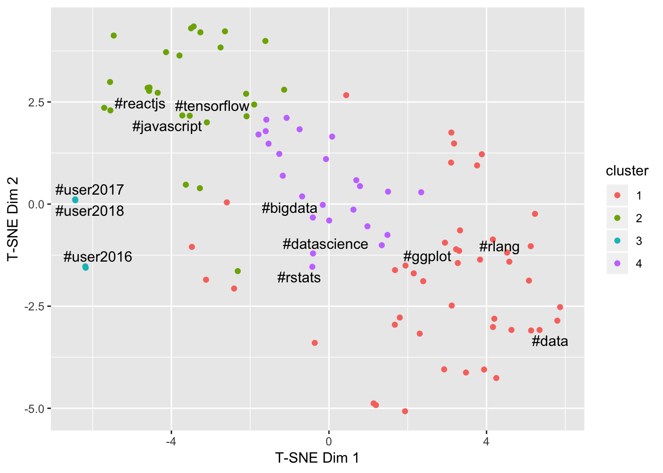
These features also allowed me to understand relationships between engagement and diversity, noting that the clusters are still quite visible when viewed against these dimensions:
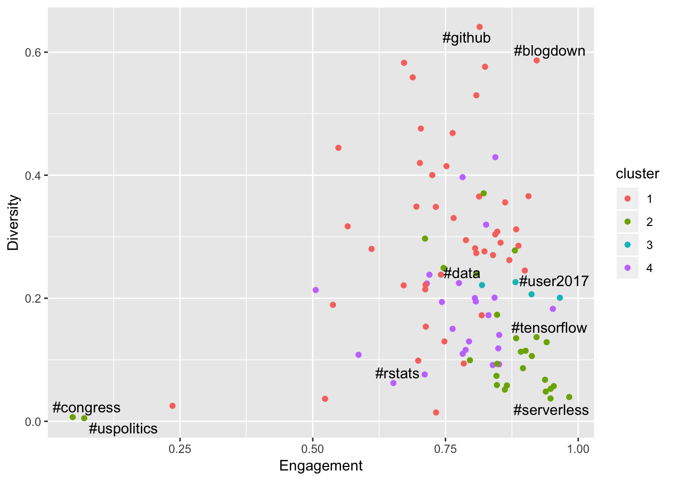
The key finding here was that the success of a community has a surprising relationship with diversity - strong communities tend to demonstrate a small number of key contributors relative to the total amount of content - a tight community is a strong community.
Individual Connections
As the final component to this project, I set out to build networks of Twitter users to try and extract interesting structure without looking at the content of the tweets. I wrote about this work in my final blog post for the project: The R Twitter Network.
To achieve this I built graphs based on:
- Follower networks
- Activity networks (retweeting and mentioning)
Both of these graphs required a significant amount of additional data which had to be gathered via repeated calls to the Twitter API, and I was significantly restricted by the rate limits imposed by Twitter. Accordingly the follower network graph was restricted to the top 1000 community members, and the activity network graph was restricted to activity in the month of July 2018.
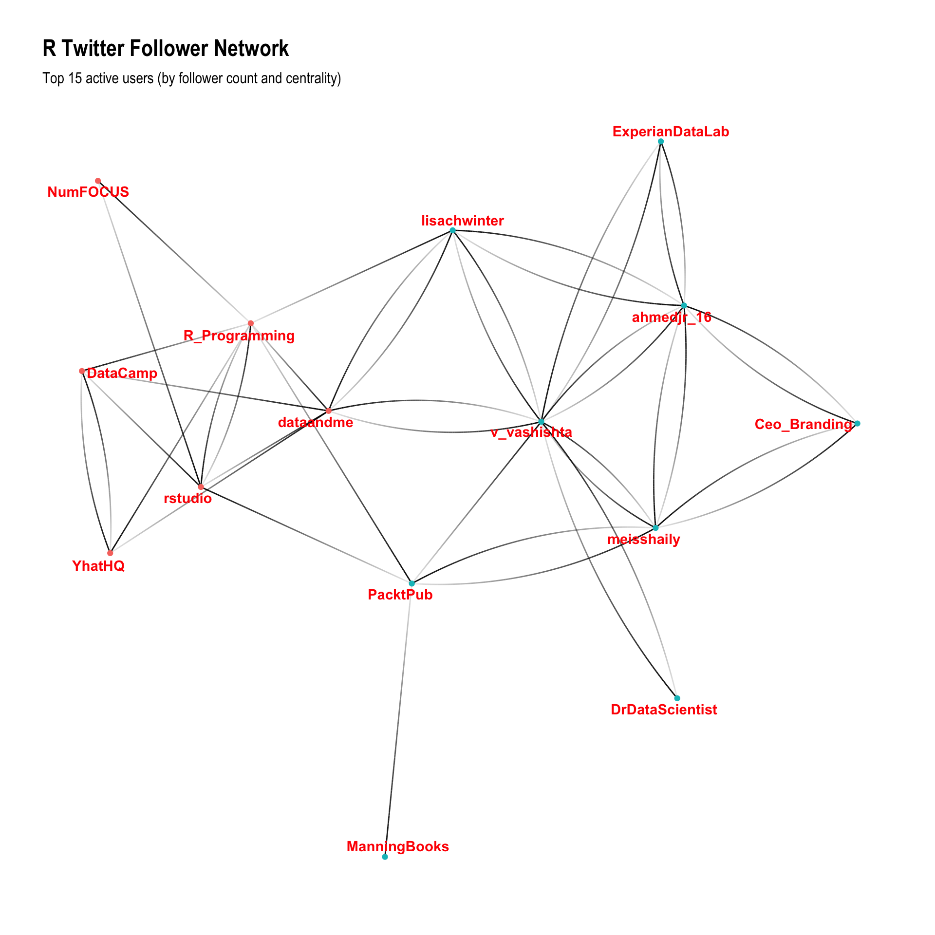
Using the follower network graph, I was able to demonstrate that the standard graph layout engines were able to identify different network structures, and that many of these structures were successfully uncovered by standard community detection algorithms:
Looking at the top 15 users, the follower networks also displayed a clear structural split between “technical contributors”” to the community and people who people who appear to be using Twitter as part of an influencing or brand building strategy.
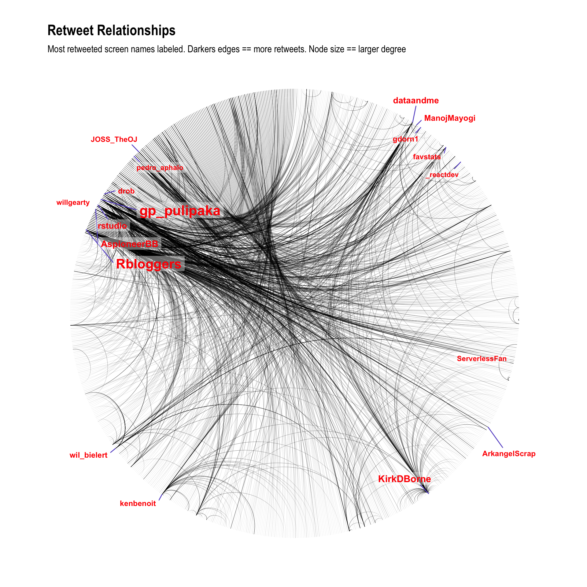
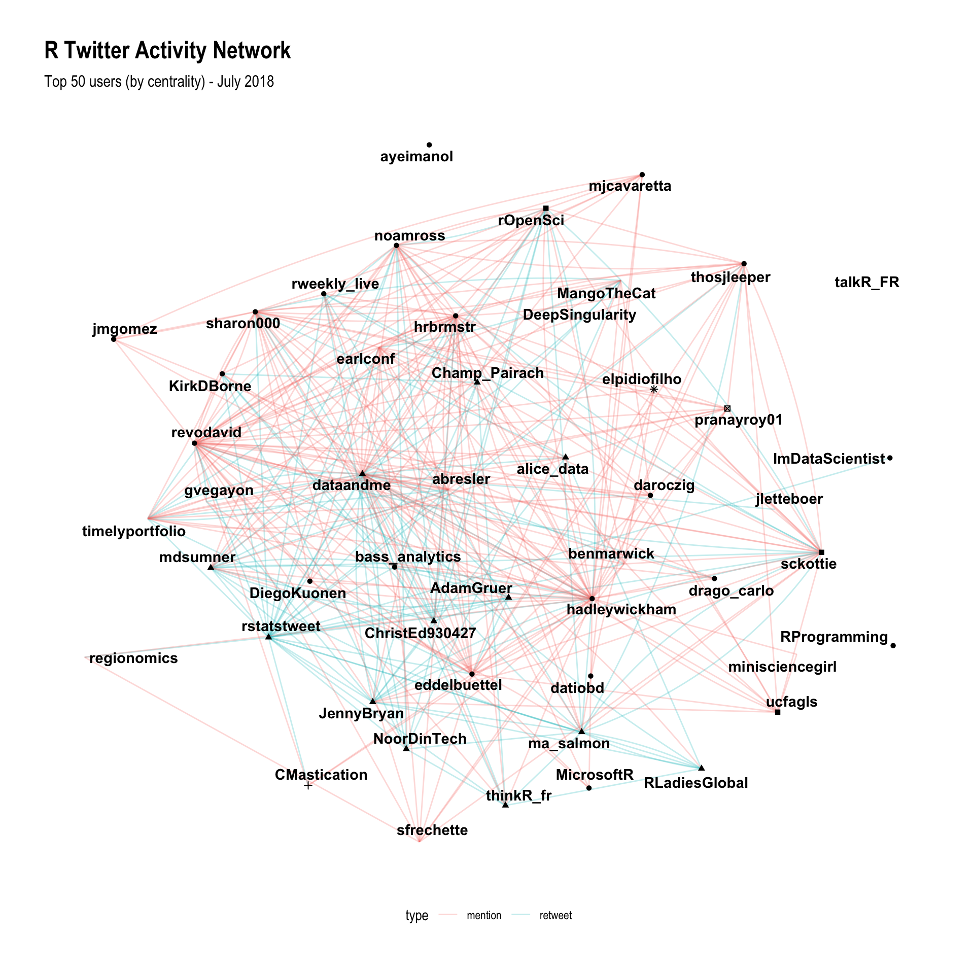
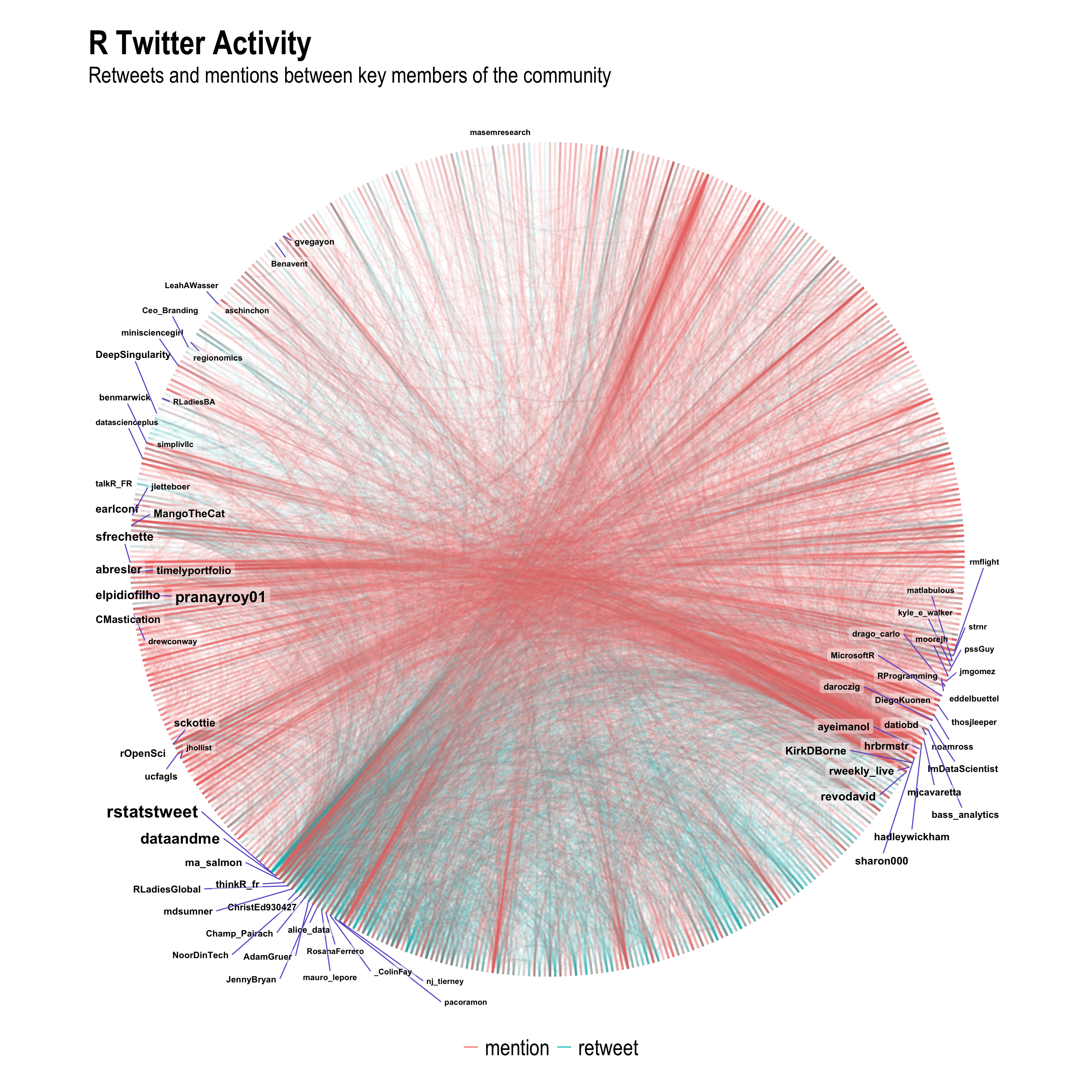
Using the activity networks proved to be even more fruitful, because it takes daily conversations into account rather than static follower relationships. I was able to identify key structures in the engagement network which successfully identified all of the key players in the R Twitter communities:
Using these same relationships but using a circular arc plot to visualise the edges, I was able to create probably the most informative plot of the entire project, clearly showing the differences in interaction between the R package development community (e.g. Hadley) on the right side, the R users community at the bottom (e.g. Mara) at the bottom, and then a number of interconnected communities (e.g. different languages) at the top left of the graph.
Conclusions
At the start of the project I set out to:
- Identify structure inherent in the network to create a “town map” for the R community
- Use a data-driven approach to help newcomers identify who to follow in the R Twitter community
- Identify whether there was evidence to support Steph’s assertion that the R sub-culture is really made up of several independent but connected communities
I think that with the above insights I have more than achieved the project objectives, and I can’t wait to share the findings with the R community. I am a little surprised to see such strong structure emerging from such a limited data set and I would love to see how much more rich this structure could become if someone else (in a future project perhaps) was able to incorporate additional datasets like mailing lists, GitHub repos, meetup attendance, conference attendance or organisational affiliation.