I’ve been skirting around the issue for a few blog posts, but now I think it’s finally time to dive in to a full-blown social network analysis of my R Twitter dataset. Thinking about it at a high level, there are probably two ways to analyse this network:
- Follower networks
- Activity networks (retweeting and mentioning)
I’ll need to gather a bit more data about my tweets in order to get this done, and I’ll be using some of the ideas from Bob Rudis’ book to help me do this.
Follower Networks
To understand how networks of followers might form communities, I need to build a dataset of these follower relationships by retrieving them through the API. I will use the get_followers() function to retrieve the details of users who follow each of the top 1000 participants in the R Twitter community.
This will allow me to include all of the passive “lurking” participants in the community, who aren’t in my dataset because they haven’t tweeted with a hashtag but are following (and presumably reading) others in the community. I obviously won’t be able to plot them all, but having these extended networks will help me to consider the whole network, not just the key players.
Testing the get_followers() function
I’ll take this function for a spin first to understand how it works. I’ll also grab my friends (people I follow) to see how the two relate.
library(tidyverse)
library(rtweet)
(my_followers <- get_followers("perrystephenson"))
## # A tibble: 240 x 1
## user_id
## <chr>
## 1 1042801737697042433
## 2 1032933195291996160
## 3 952118938414075905
## 4 17369964
## 5 276508048
## 6 1028892758159712257
## 7 487810501
## 8 368551889
## 9 45099437
## 10 130264443
## # ... with 230 more rows(my_friends <- get_friends("perrystephenson"))## # A tibble: 185 x 2
## user user_id
## <chr> <chr>
## 1 perrystephenson 74860873
## 2 perrystephenson 787709936
## 3 perrystephenson 26259576
## 4 perrystephenson 19429174
## 5 perrystephenson 901028924158746624
## 6 perrystephenson 374659701
## 7 perrystephenson 41435950
## 8 perrystephenson 18463930
## 9 perrystephenson 84618490
## 10 perrystephenson 2440258777
## # ... with 175 more rowsThis function returns a list of numeric user IDs rather than strings, which is handy because it means I can analyse them without embarrassing anyone! I’ll bring them into a single table to summarise who follows me, who I follow, and who mutually follows me.
my_friends %>%
  select(user_id) %>%
  mutate(i_follow = TRUE) %>%
  full_join(my_followers %>% mutate(follows_me = TRUE), by = 'user_id') %>%
  mutate_all(funs(replace(., which(is.na(.)), FALSE))) %>%
  select(2:3) %>% table
## follows_me
## i_follow FALSE TRUE
## FALSE 0 163
## TRUE 108 77I think this means that I’m popular? It certainly means that I don’t follow back nearly as often as I think I do!
Getting followers at scale
I can now loop through the users in my scraped dataset, and collect both the followers and friends for analyis.
all_users <- readRDS("~/data/twitter-cache/tweets.rds") %>%
  pull(user) %>% unique
length(all_users)
## [1] 26274This could take a while! Twitter’s rate limit lets you collect followers for 15 users every 15 minutes, which means a maximum rate of 1,440 users per day. At this rate I’m looking at nearly three weeks of continuous querying! I’ll have to prioritise which users to collect, and ordering by decreasing number of followers seems like a sensible way to do this. Thankfully I can get this info (number of followers) in bulk!
user_details <- lookup_users(all_users)user_details %>% arrange(desc(followers_count)) %>% select(screen_name, followers_count)## # A tibble: 26,109 x 2
## screen_name followers_count
## <chr> <int>
## 1 NatureNews 1879572
## 2 timoreilly 1809704
## 3 LinkedIn 1446530
## 4 USGS 705039
## 5 Azure 629349
## 6 USDA 609363
## 7 zaibatsu 552127
## 8 bengoldacre 481556
## 9 annemariayritys 471204
## 10 el_BID 370660
## # ... with 26,099 more rowsThere are a few users with very high follower counts (that will take a long time to extract), so I’ll filter this list for users that have at least 5 tweets in the original dataset in order to make sure that I’m only pulling followers networks for active R Tweeters.
active_users <- readRDS("~/data/twitter-cache/tweets.rds") %>%
  count(user) %>%
  filter(n >= 5) %>%
  pull(user) %>% unique
length(active_users)
## [1] 7226I’ll pull the top 1000 users from this set (arranged by followers) to make sure I have the most important players in the network. Even this takes over a day to run!
active_users_filtered <- user_details %>%
  filter(screen_name %in% active_users) %>%
  arrange(desc(followers_count)) %>%
  slice(1:1000) %>%
  pull(screen_name)
followers <- vector(mode = 'list', length = length(active_users_filtered))
for (i in seq_along(active_users_filtered)) {
message("Getting followers for user #", i, "/1000")
followers[[i]] <- get_followers(active_users_filtered[i],
n = "all", retryonratelimit = TRUE)
}Building the network
I’ll now need to massage this list of vectors into an edge list. I’ll leave the numeric user IDs for now, as it’s going to take about 16 hours to get all of their screen names back through the API (90,000 users every 15 minutes, with nearly 6 million unique followers). This means I need to make the usernames I already have into numeric user IDs.
make_df_from_followers <- function(followers, screen_name) {
  if (!is.null(followers)) {
    tibble(from_id = followers[[1]],
           to_name = screen_name)
  }
}

edges_tmp <- map2(followers, active_users_filtered, make_df_from_followers) %>%
  bind_rows %>%
  left_join(user_details, by = c("to_name" = 'screen_name')) %>%
  select(from_id, user_id) %>%
  rename(to_id = user_id)
edges_tmp
## # A tibble: 12,044,734 x 2
## from_id to_id
## <chr> <chr>
## 1 915233890700324864 34181507
## 2 866041710748585984 34181507
## 3 3121055784 34181507
## 4 1030407882855141376 34181507
## 5 3114251045 34181507
## 6 2835046515 34181507
## 7 941655436662530048 34181507
## 8 953220385956233216 34181507
## 9 1038005890924699648 34181507
## 10 97616205 34181507
## # ... with 12,044,724 more rowsNow I’ll use this temporary table to build a node list. I’ll join to the user details table to fill in the details where they exist.
nodes_df <- tibble(user_id = unique(c(edges_tmp$from_id, edges_tmp$to_id))) %>%
  mutate(ID = row_number()) %>%
  left_join(user_details, by = c("user_id")) %>%
  select(ID, user_id, screen_name, followers_count, favourites_count)
Now I can create the final edge table using these new node IDs.
edges_df <- edges_tmp %>%
  left_join(nodes_df, by = c('from_id' = 'user_id')) %>%
  rename('from' = 'ID') %>%
  left_join(nodes_df, by = c('to_id' = 'user_id')) %>%
  rename('to' = 'ID') %>%
  select(from, to)
Finally we can bring all of these nodes and edges together into a graph.
library(igraph)
library(tidygraph)
graph <- graph_from_data_frame(d = edges_df, vertices = nodes_df) %>%
  as_tbl_graph()
graph
## # A tbl_graph: 5734465 nodes and 12044734 edges
## #
## # A directed multigraph with 1 component
## #
## # Node Data: 5,734,465 x 5 (active)
## name user_id screen_name followers_count favourites_count
## <chr> <chr> <chr> <int> <int>
## 1 1 915233890700324864 <NA> NA NA
## 2 2 866041710748585984 <NA> NA NA
## 3 3 3121055784 <NA> NA NA
## 4 4 1030407882855141376 <NA> NA NA
## 5 5 3114251045 <NA> NA NA
## 6 6 2835046515 <NA> NA NA
## # ... with 5.734e+06 more rows
## #
## # Edge Data: 12,044,734 x 2
## from to
## <int> <int>
## 1 1 1136958
## 2 2 1136958
## 3 3 1136958
## # ... with 1.204e+07 more rowsPlotting the graph
I obviously can’t plot 12 million edges, as it’s both a huge amount of computation and also a waste of time (because it would be a hairball). But what I can do is:
- Filter for just those 1000 active users from the previous step (i.e. ignore all of the passive followers)
- Use a community detection algorithm to identify potential sub-communities
- Use ggraph to plot the nodes, and use gganimate to switch between a few different layout algorithms
I won’t plot the edges for this visualisation because I don’t think they’re going to add anything useful.
library(ggraph)

layout_list <- list(
  list(layout = 'star'),
  list(layout = 'circle'),
  list(layout = 'gem'),
  list(layout = 'graphopt'),
  list(layout = 'grid'),
  list(layout = 'mds'),
  list(layout = 'randomly'),
  list(layout = 'fr'),
  list(layout = 'kk'),
  list(layout = 'nicely'),
  list(layout = 'lgl'),
  list(layout = 'drl'))

filtered_graph <- graph %>%
  filter(screen_name %in% active_users_filtered) %>%
  mutate(community = group_walktrap()) %>%
  filter(community %in% 1:3) # Getting rid of tiny communities

layouts <- filtered_graph %>%
  invoke_map('create_layout', layout_list, graph = .) %>%
  set_names(unlist(layout_list)) %>%
  bind_rows(.id = 'layout')

dummy_layout <- create_layout(filtered_graph, 'nicely')

attr(layouts, 'graph') <- attr(dummy_layout, 'graph')
attr(layouts, 'circular') <- FALSE

g <- ggraph(layouts) +
  geom_node_point(aes(col = as.factor(community))) +
  theme_graph() +
  theme(legend.position = 'none') +
  labs(title = 'R Twitter Communities',
       subtitle = 'Using {closest_state} layout engine') +
  transition_states(layout, 1, 2) +
  ease_aes('linear') +
  view_follow()

animate(g, fps = 30, nframes = 1000)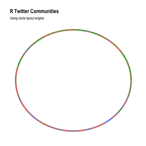
This obviously doesn’t tell much of a story, but it shows that the “random walk” community detection algorithm is picking up on the same structure as many of the graph layout algorithms. I’ll have another go at this using a subset of very active users (over 100 tweets) and then pull followers for the top 50 users (by follower count) to see if we can find something more interesting here.
active_users <- readRDS("~/data/twitter-cache/tweets.rds") %>%
  count(user) %>%
  filter(n >= 100) %>%
  pull(user) %>% unique

active_users_filtered <- user_details %>%
  filter(screen_name %in% active_users) %>%
  arrange(desc(followers_count)) %>%
  slice(1:50) %>%
  pull(screen_name)
followers <- vector(mode = 'list', length = length(active_users_filtered))
for (i in seq_along(active_users_filtered)) {
message("Getting followers for user #", i, "/50")
followers[[i]] <- get_followers(active_users_filtered[i],
n = "all", retryonratelimit = TRUE)
}edges_tmp <- map2(followers, active_users_filtered, make_df_from_followers) %>%
bind_rows %>%
left_join(user_details, by = c("to_name" = 'screen_name')) %>%
select(from_id, user_id) %>%
rename(to_id = user_id)
nodes_df <- tibble(user_id = unique(c(edges_tmp$from_id, edges_tmp$to_id))) %>%
mutate(ID = row_number()) %>%
left_join(user_details, by = c("user_id")) %>%
select(ID, user_id, screen_name, followers_count, favourites_count)
edges_df <- edges_tmp %>%
left_join(nodes_df, by = c('from_id' = 'user_id')) %>%
rename('from' = 'ID') %>%
left_join(nodes_df, by = c('to_id' = 'user_id')) %>%
rename('to' = 'ID') %>%
select(from, to)
graph <- graph_from_data_frame(d = edges_df, vertices = nodes_df) %>%
as_tbl_graph() %>%
filter(screen_name %in% active_users_filtered)
graph## # A tbl_graph: 50 nodes and 824 edges
## #
## # A directed simple graph with 1 component
## #
## # Node Data: 50 x 5 (active)
## name user_id screen_name followers_count favourites_count
## <chr> <chr> <chr> <int> <int>
## 1 11773 191029020 v_vashishta 31044 1493
## 2 40782 4153160533 meisshaily 17682 1243
## 3 41343 343781572 Ceo_Branding 32302 3251
## 4 68901 17778401 PacktPub 25536 2443
## 5 91862 1068951084 NumFOCUS 10661 5411
## 6 151616 3145295054 ahmedjr_16 24400 22287
## # ... with 44 more rows
## #
## # Edge Data: 824 x 2
## from to
## <int> <int>
## 1 1 29
## 2 2 29
## 3 3 29
## # ... with 821 more rowsfiltered_graph <- graph %>%
mutate(community = group_walktrap())
ggraph(filtered_graph, layout = 'nicely') +
geom_edge_fan(aes(alpha = ..index..)) +
geom_node_point(aes(col = as.factor(community))) +
theme_graph() +
theme(legend.position = 'none') +
labs(title = 'R Twitter Communities',
subtitle = 'Top 50 users')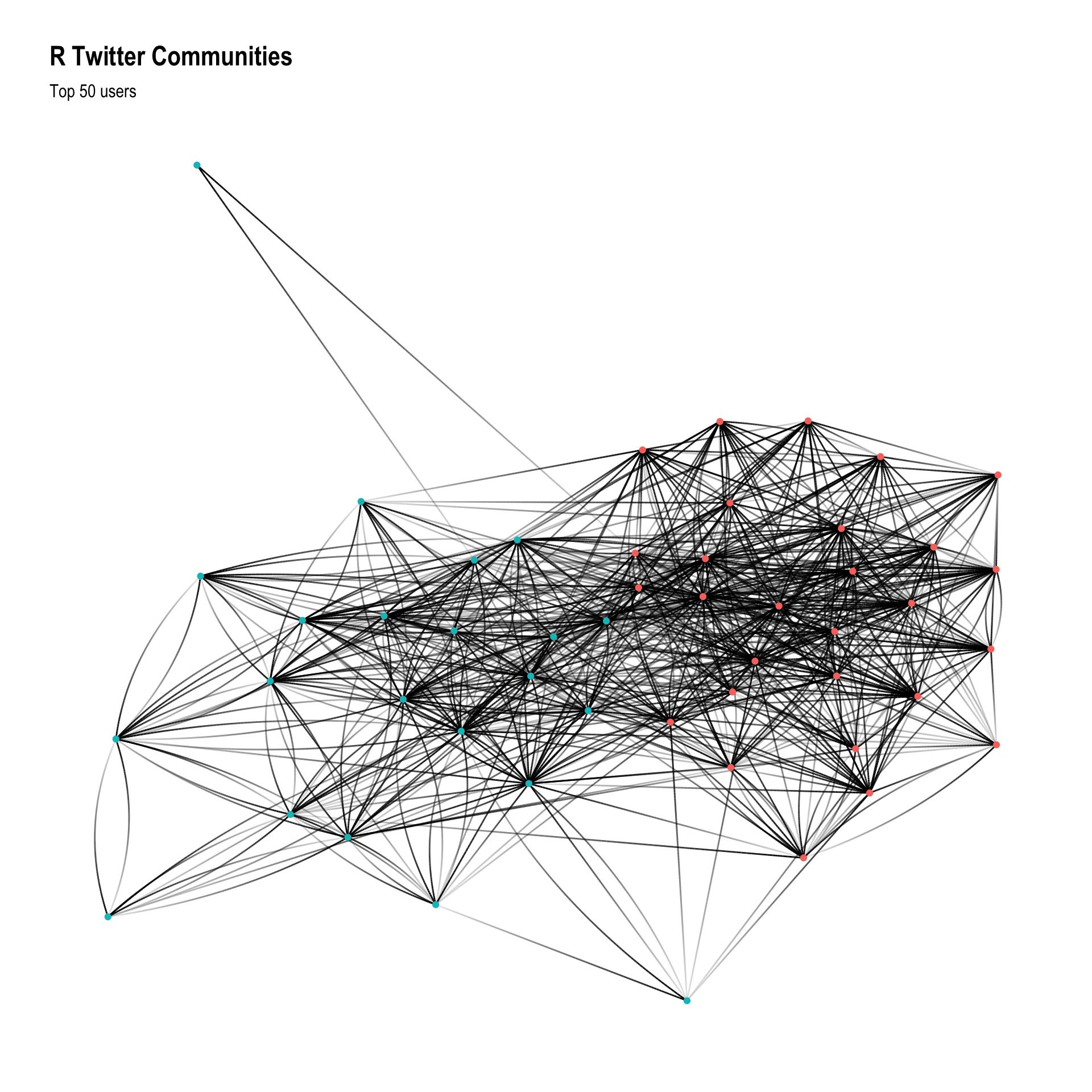
This is still a bit of a mess, let’s filter it a bit more based on centrality.
filtered_graph <- graph %>%
  mutate(community = group_walktrap()) %>%
  mutate(centrality = centrality_random_walk()) %>%
  arrange(desc(centrality)) %>%
  slice(1:15)

ggraph(filtered_graph, layout = 'kk') +
  geom_edge_fan(aes(alpha = ..index..)) +
  geom_node_point(aes(col = as.factor(community))) +
  geom_node_text(aes(label = screen_name), repel = TRUE, color = "red",
                 segment.colour = 'slateblue', fontface = "bold") +
  theme_graph() +
  theme(legend.position = 'none') +
  labs(title = 'R Twitter Follower Network',
       subtitle = 'Top 15 active users (by follower count and centrality)')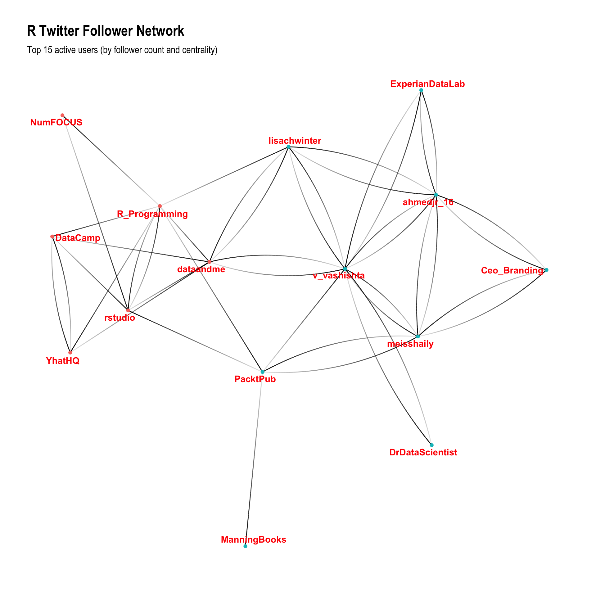
It’s cool to see Mara (@dataandme) in the centre of this graph (it’s her job!) and it’s a bit interesting to see that whilst I recognise about half of the red cluster, I don’t recognise any users from the green cluster. Manual inspection reveals that the red cluster seem to be mainly “technical” people/organisations generating useful content, and the green cluster are people who use the term “influencer” without any (apparent) shame, building their network for the purpose of promotion.
Activity Networks
This is a bit harder than the follower network because most of the data is at the “tweet” granularity, rather than being at the “user” level. To build the edge list I will have to:
- Find out who has retweeted each tweet, then aggregate those retweets for each pair of users
- Parse the tweets to identify each user who was mentioned in each tweet, then aggregate those mentions for each pair of users
Collecting retweets
The first one of these is really hard to do quickly, so I’ll limit this part of the analysis to a single month (July 2018). Even this took severals days to complete, due to the rate limit on the Twitter API.
Note that I’m pulling the tweet IDs out from the URL because the tweet IDs are so large they’re losing information by being stored as floating point number - using the text representation of the Tweet ID resolves this issue.
tweets <- readRDS("~/data/twitter-cache/tweets.rds")
tweets_with_rts <- tweets %>%
  filter(lubridate::year(timestamp) == 2018) %>%
  filter(lubridate::month(timestamp) == 7) %>%
  filter(retweets > 0) %>%
  pull(`url`) %>%
  str_extract('[0-9]+$')
retweets <- vector(mode = 'list', length = length(tweets_with_rts))
for (i in seq_along(tweets_with_rts)) {
message("Getting retweets for tweet #", i, "/9891")
retweets[[i]] <- get_retweeters(as.character(tweets_with_rts[i]))
# Sleep every 50 to let the rate limit reset
if(i %% 50 == 0) Sys.sleep(15*60)
}retweets <- readRDS("~/data/twitter-cache/retweets.rds")make_df_from_retweets <- function(retweets, tweet) {
if (nrow(retweets) > 0) {
tibble(from_id = retweets[[1]],
tweet_id = tweet)
}
}
tweets_for_joining <- tweets %>%
mutate(tweet_id = str_extract(url, '[0-9]+$'))
retweet_edges <- map2(retweets, tweets_with_rts, make_df_from_retweets) %>%
bind_rows %>%
left_join(tweets_for_joining, by = c("tweet_id")) %>%
select(from_id, user) %>%
rename(to_name = user) %>%
left_join(user_details, by = c('from_id' = 'user_id')) %>%
select(screen_name, to_name) %>%
rename(from_name = screen_name) %>%
filter(!is.na(to_name) & !is.na(from_name)) %>%
mutate(type = 'retweet') %>%
count(from_name, to_name, type)Collecting mentions
This one is a bit easier because it doesn’t require making thousands of calls to the Twitter API - I can just extract it directly from the tweets I already have. To maintain consistency with the retweets I’ll also limit this to July 2018.
library(tidytext)
mention_edges <- tweets %>%
  select(user, text) %>%
  unnest_tokens("words", "text", "tweets") %>%
  filter(str_detect(words, "^@")) %>%
  mutate(from_name = user,
         to_name = str_remove(words, "@"),
         type = "mention") %>%
  count(from_name, to_name, type)
Bring it all together
Firstly I’ll join the two edge datasets together into a temporary dataframe, then use it to build the node list. Then I’ll use the node list to join the new node IDs back into the edge list, and create the graph object.
edges_tmp <- bind_rows(retweet_edges, mention_edges)

nodes_df <- tibble(user_name = unique(c(edges_tmp$from_name, edges_tmp$to_name))) %>%
  mutate(ID = row_number()) %>%
  left_join(user_details, by = c("user_name" = "screen_name")) %>%
  select(ID, user_name, followers_count)

edges_df <- edges_tmp %>%
  left_join(nodes_df, by = c('from_name' = 'user_name')) %>%
  rename('from' = 'ID') %>%
  left_join(nodes_df, by = c('to_name' = 'user_name')) %>%
  rename('to' = 'ID') %>%
  select(from, to, type, n)

graph <- graph_from_data_frame(d = edges_df, vertices = nodes_df) %>%
  as_tbl_graph()
graph
## # A tbl_graph: 49403 nodes and 115896 edges
## #
## # A directed multigraph with 1470 components
## #
## # Node Data: 49,403 x 3 (active)
## name user_name followers_count
## <chr> <chr> <int>
## 1 1 __fusion 359
## 2 2 _aaronmiles 316
## 3 3 _abichat 103
## 4 4 _BrettJohnson 248
## 5 5 _ColinFay 5423
## 6 6 _Daniel_Nunez 96
## # ... with 4.94e+04 more rows
## #
## # Edge Data: 115,896 x 4
## from to type n
## <int> <int> <chr> <int>
## 1 1 3422 retweet 1
## 2 2 2815 retweet 1
## 3 2 3041 retweet 4
## # ... with 1.159e+05 more rowsWith this done, I’ll calculate a measure of centrality and plot the top 25 most central players in the network.
graph %>%
  mutate(community = as.factor(group_walktrap(weight = n))) %>%
  mutate(centrality = centrality_degree(weight = n)) %>%
  top_n(25, centrality) %>%
  ggraph(layout = 'kk') +
  geom_edge_fan(aes(col = type), alpha = 0.25) +
  geom_node_point(aes(shape = community)) +
  geom_node_text(aes(label = user_name), repel = TRUE, color = "black",
                 segment.colour = 'slateblue', fontface = "bold") +
  theme_graph() +
  guides(alpha = FALSE, colour = FALSE, shape = FALSE) +
  theme(legend.position = 'bottom') +
  labs(title = 'R Twitter Activity Network',
       subtitle = 'Top 25 users (by centrality) - July 2018')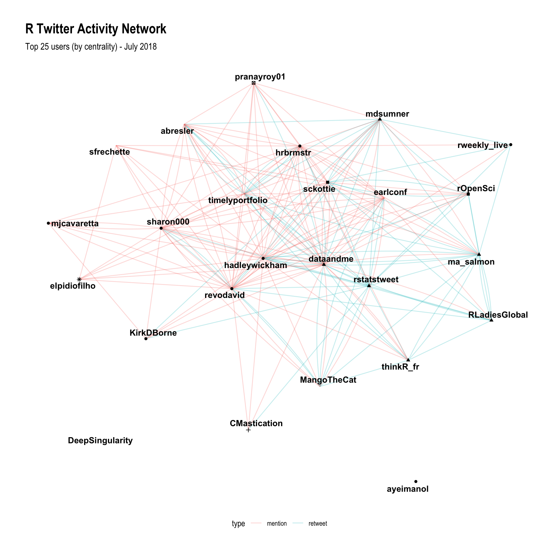
This is great! It has shown Hadley and Mara at the middle of the network (which matches my observations of the community), and the clustering has done such a good job that all of the accounts I recognise have fallen into two distinct clusters; which makes sense, because I’m just a normal part of this network and it’s entirely expected that I would only recognise those from my sub-communities!
I suspect that the layout algorithm could be a little better, so I’ll use a force directed graph to allow me to exploit the strength of the edges.
library(particles)
graph %>%
  mutate(community = as.factor(group_walktrap(weights = n))) %>%
  mutate(centrality = centrality_degree(weights = n, normalized = TRUE)) %>%
  top_n(50, centrality) %E>%
  filter(n > 1) %>%
  simulate() %>%
  wield(link_force, strength = (n/max(n)^2)) %>%
  wield(manybody_force, strength = - sqrt(centrality)) %>%
  wield(center_force) %>%
  evolve() %>%
  as_tbl_graph() %>%
  ggraph(layout = 'nicely') +
  geom_edge_fan(aes(col = type), alpha = 0.25) +
  geom_node_point(aes(shape = community)) +
  geom_node_text(aes(label = user_name), repel = TRUE, color = "black",
                 segment.colour = 'slateblue', fontface = "bold") +
  theme_graph() +
  guides(alpha = FALSE, colour = FALSE, shape = FALSE) +
  theme(legend.position = 'bottom') +
  labs(title = 'R Twitter Activity Network',
subtitle = 'Top 50 users (by centrality) - July 2018') 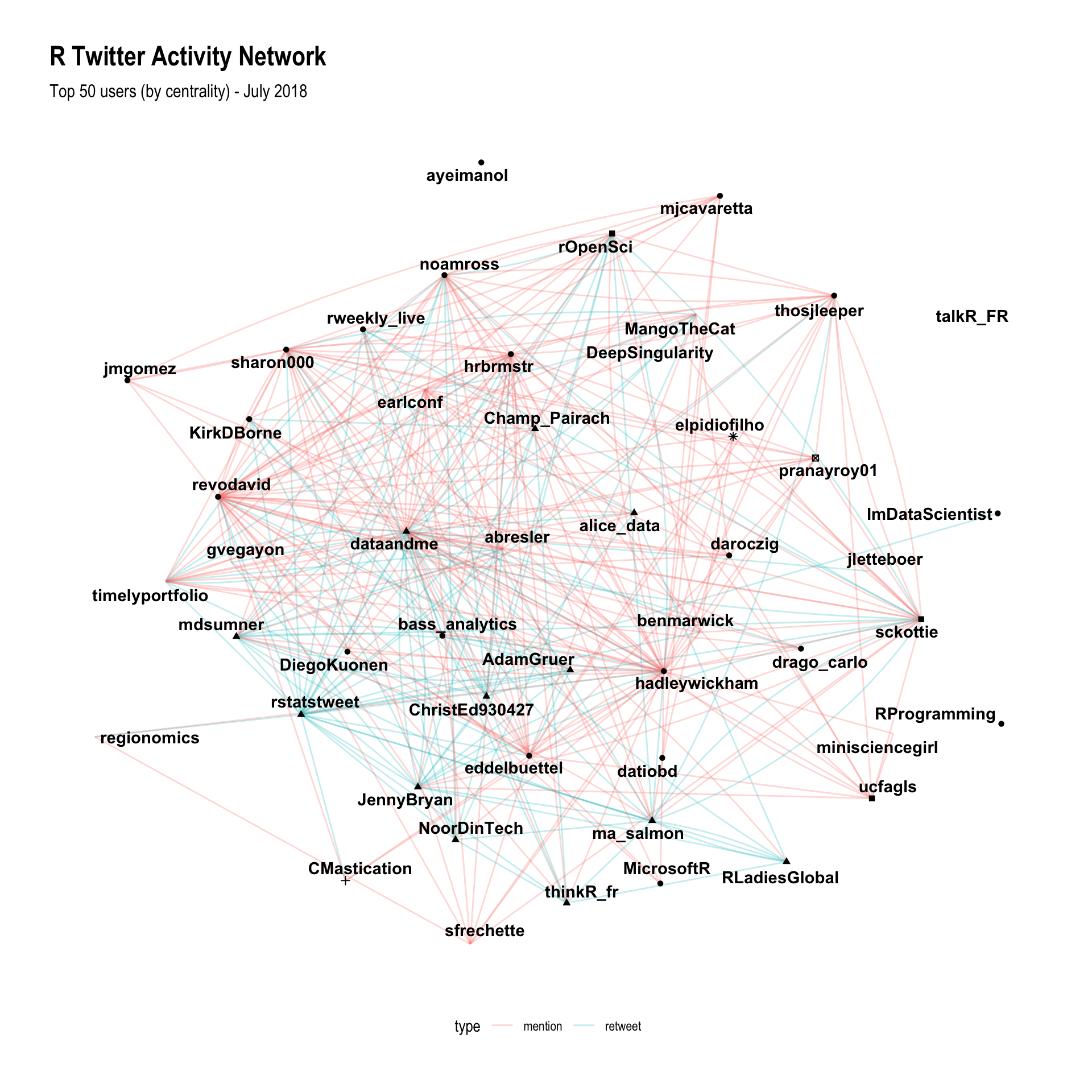
The additional controls for this visualisation allow me to include more points (50), which means that I can start to pull out even more of the structure of the network. Hadley and Mara are both very clearly the centre of the network, along with Dirk Eddelbuettel and Bob Rudis. It’s also interesting to look at how the different types of activities are organised in the graph - there are a few users who interact almost exclusively through retweeting (@rstatstweet and @RLadiesGlobal), and a few users who interact mostly through mentions (Hadley and Dirk).
The other interesting part of these plots is that they finally start to help me answer the question “who should I follow on Twitter?”. By using this graph, you can start with someone you already follow (say for example, you like following Dirk) and then look at who they’re interacting with, but also who is nearby in the network. In the case of Dirk, you might be interested in following @microsoftR, @ma_salmon, @hadleywickham or @JennyBryan. Alternatively, if you already follow a few people on Twitter and you’re wondering whether you’re getting the best of R Twitter, you can use this graph to find areas of the network that you don’t know about, and follow influential people from those sections of the network. In my case that would mean following @MangoTheCat or @revodavid.
Finally, there is one more visualisation technique which could show useful information, the circular arc plot.
graph %>%
  mutate(community = group_walktrap(weights = n)) %>%
  mutate(centrality = centrality_degree(weights = n)) %>%
  arrange(community, centrality) %>%
  mutate(ranking = row_number()) %>%
  top_n(500, centrality) %>%
  mutate(node_label = if_else(centrality > 300, user_name, "")) %>%
  mutate(node_size = if_else(centrality > 300, centrality, 0)) %>%
  ggraph(layout = 'linear', circular = TRUE, sort.by = 'ranking') +
  geom_edge_arc(alpha=0.05, aes(col = type, edge_width = n)) +
  geom_node_label(aes(label=node_label, size=node_size),
                  label.size=0, fill="#ffffff66", segment.colour="slateblue",
                  color="black", repel=TRUE, fontface="bold",
                  show.legend = FALSE) +
  coord_fixed() +
  scale_size_area(trans="sqrt") +
  labs(title="R Twitter Activity",
       subtitle="Retweets and mentions between key members of the community") +
  theme_graph() +
  guides(edge_width = FALSE,
         edge_colour = guide_legend(title = NULL,
                                    override.aes = list(edge_alpha = 1))) +
  theme(legend.position="bottom",
        plot.title = element_text(size = rel(3)),
        plot.subtitle = element_text(size = rel(2)),
        legend.text = element_text(size = rel(2)))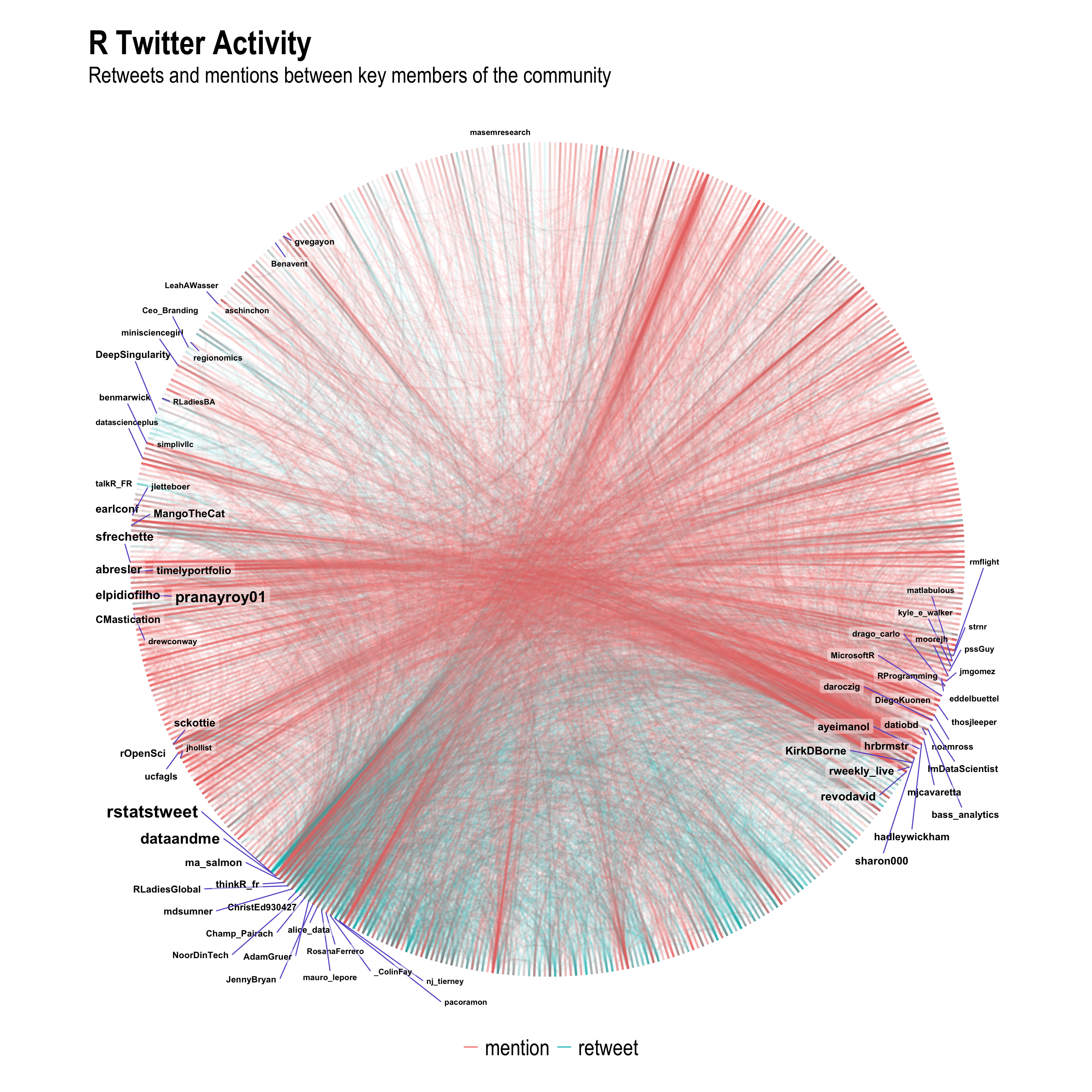
Well this is definitely the prettiest plot I’ve ever produced, but does it tell me anything new? I can see a few things of interest here:
- Some of the automatically detected communities are driven by mentions (red) and others are driven by retweets (green).
- There seems to be a split between the “developer” community (on the right) and the “expert users” community (at the bottom). It also seems like there is a difference in the use of mentions and retweets between these two communities.
- A third community on the left side seems to be “multilingual” - this community seems to have some very technical people who are talking about R but also about other technologies.
This is the first time I’ve seen the split between developers and users so clearly - Roger D. Peng (@rdpeng) made a big point of this feature of the community when he also spoke at UseR! 2018.
Conclusion
Clearly, there is a big difference in the structure of the static follower network and the dynamic activity networks. Both are informative for helping new users identify structure in the community, and helping to identify additional members of the community that might be worth following.