I don’t remember how I came across this, but I found a paper which proposes methods for hashtag categorisation and community engagement. The general approach is to calculate a whole bunch of sequential features and then use those features to discover clusters using techniques like k-means. In this post I will use some of the approaches outlined in the paper to see what I can learn.
But before I get started, I will load in the dataset, pull out the hashtags, and filter out all of the unrelated #nintendo tweets that I discovered in the previous post.
library(tidyverse)
library(tidytext)
library(lubridate)

tweets <- readRDS("~/data/twitter-cache/tweets.rds")

hashtags <- tweets %>%
  filter(!str_detect(text, "nintendo")) %>%
  unnest_tokens(word, text, "tweets") %>%
  filter(str_detect(word, "^#")) %>%
  select("tweet-id", "word", "timestamp") %>%
  rename(tweet = "tweet-id",
         name = "word") %>%
  distinct()
Building Blocks
The paper suggests a number of coarse features which can be used to cluster the hashtags. Each of these features has a fairly straight-forward definition, and each will be implemented below, but first I’ll need to do a bit of work putting together the building blocks that I’ll need to calculate these features. For each function, I will test it immediately after by calculating the feature for the #rstats hashtag.
Volume
The paper defines volume as follows:
feat_volume <- function(df, hashtag, start_date, end_date) {
  df %>%
    filter(name == hashtag) %>%
    filter(timestamp >= as.Date(start_date)) %>%
    filter(as.Date(timestamp) <= as.Date(end_date)) %>%
    nrow() %>% log()
}

feat_volume(hashtags, "#rstats", "2017-01-01", "2017-12-31")
## [1] 11.41536The paper did not specify which base to use for the logarithm, so I have assumed it is the natural logarithm.
Normalised Time Series
This isn’t really a feature by itself but it will be used to calculate many other features.
feat_nts <- function(df, hashtag, start_date, end_date) {
  total_hours <- as.numeric(difftime(as.Date(end_date),
                                     as.Date(start_date),
                                     units = "hours")) + 24
  span_hours <- tibble(hours = 1:total_hours)

  df %>%
    filter(name == hashtag) %>%
    filter(timestamp >= as.Date(start_date)) %>%
    filter(as.Date(timestamp) <= as.Date(end_date)) %>%
    mutate(hours = ceiling(as.numeric(difftime(timestamp,
                                    as_datetime(ymd(start_date)),
                                    units = "hours")))) %>%
    count(name, hours) %>%
    # Filling in the missing zeros
    right_join(span_hours, by = "hours") %>%
    mutate(name = hashtag,
           n = if_else(is.na(n), 0L, n)) %>%
    # Normalising
    mutate(n = n / sum(n))
}

feat_nts(hashtags, "#rstats", "2017-01-01", "2017-12-31")
## # A tibble: 8,760 x 3
## name hours n
## <chr> <dbl> <dbl>
## 1 #rstats 1 0.0000331
## 2 #rstats 2 0.0000110
## 3 #rstats 3 0.0000331
## 4 #rstats 4 0.0000551
## 5 #rstats 5 0.0000110
## 6 #rstats 6 0.0000661
## 7 #rstats 7 0.0000220
## 8 #rstats 8 0.0000441
## 9 #rstats 9 0.0000110
## 10 #rstats 10 0.0000220
## # ... with 8,750 more rowsAnd just to test that everything adds up to 1…
feat_nts(hashtags, "#rstats", "2017-01-01", "2017-12-31") %>% select(n) %>% sum## [1] 1Peak Hour
The peak hour for each hashtag is the hour when the hashtag was most popular.
peak_hour <- function(df, hashtag, start_date, end_date) {
  feat_nts(df, hashtag, start_date, end_date) %>%
    slice(which.max(n)) %>%
    pull(hours)
}

peak_hour(hashtags, "#rstats", "2017-01-01", "2017-12-31")
## [1] 649peak_volume <- function(df, hashtag, start_date, end_date) {
feat_nts(df, hashtag, start_date, end_date) %>%
slice(which.max(n)) %>%
pull(n)
}
peak_volume(hashtags, "#rstats", "2017-01-01", "2017-12-31")## [1] 0.001907303Discrete Fourier Transform
A number of features rely on the output of the Discrete Fourier Transform.
Brief Explanation
Click here to expand for an explanation of how this works
Without going too far into signal processing theory, it is possible to break down any time-series signal into it’s harmonic components. In R this is done using the fft() function, which returns a vector of complex numbers. The modulus of the number (i.e. the length of the complex number when plotted as a vector) represents the contribution of each harmonic frequency to the signal. The length of the vector returned by fft() is the same as the length of the input signal, however it doesn’t really make sense to interpret it this way. To interpret the signal:
- The first number is the constant offset (often referred to as the DC offset in signal processing)
- Each subsequent number represents the contribution of a specific sine wave to the overall signal
To demonstrate, we will create a signal made from a combination of sine waves - one oscillating at 5Hz (with magnitude 0.7) and another at 15Hz (with magnitude 2). We will also add a DC offset of 0.3 and then sample that signal at 100Hz (i.e. measured 100 times per second). We’ll generate 2s worth of data (200 samples).
time = 0:199 * 0.01
signal = 0.3 + 0.7 * sin(time * 5 * 2*pi) + 2 * sin(time * 15 * 2*pi)
plot(time, signal, type = "l")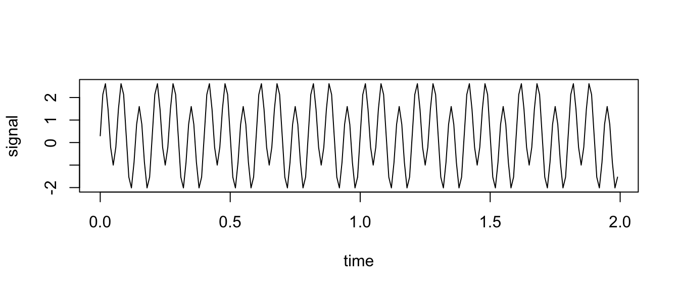
Now if we use the fft() function…
barplot(Mod(fft(signal)) / 200) # Divide by number of samples to normalise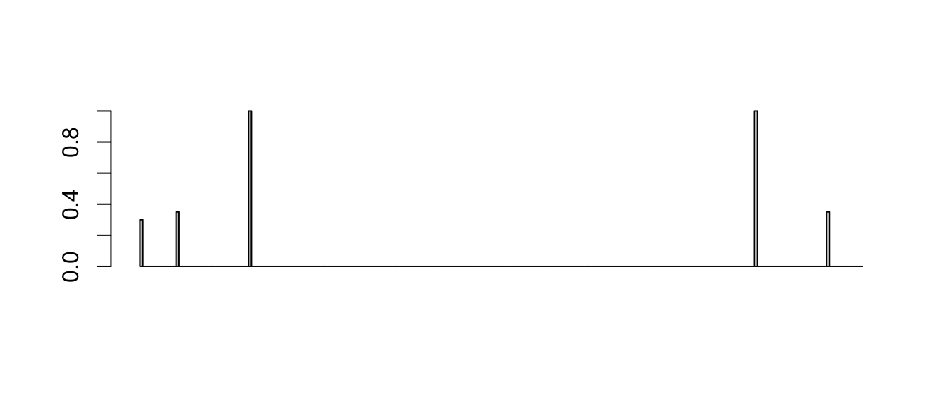
We’ll need to unpack this a little, because not everything is as it seems.
Firstly, we’ll take the first result (index 1, because we’re working in R), which is the DC offset.
fft_output <- Mod(fft(signal)) / 200 # Divide by number of samples to normalise
fft_output[1] # DC offset
## [1] 0.3This is exactly as expected.
We now need to multiply all of the other components by 2 (for reasons that are beyond the scope of this explanation) to observe the coefficients of the 5Hz and 15Hz components.
harmonic_components <- fft_output[-1] * 2
barplot(harmonic_components)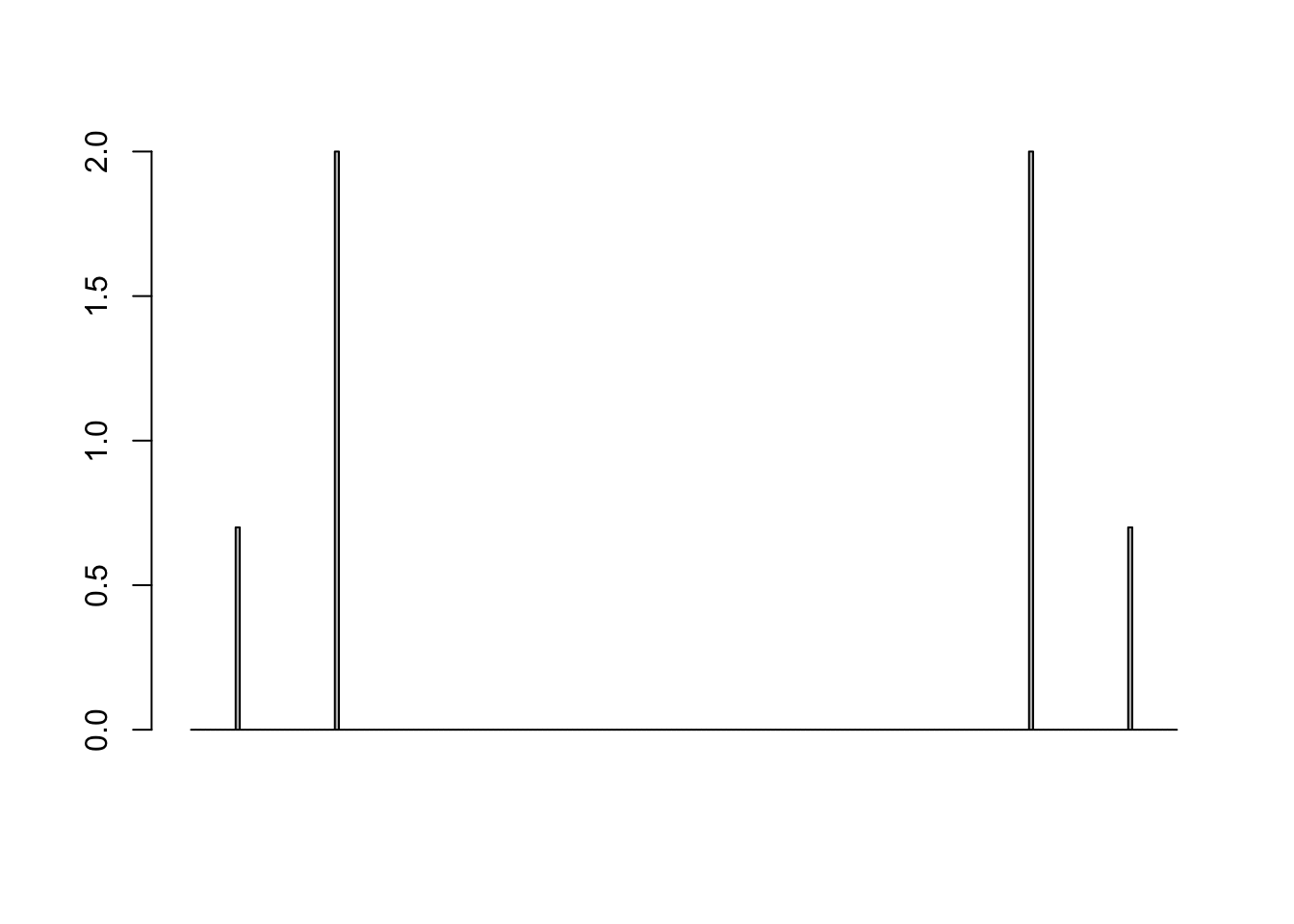
Now we can see the 0.7 amplitude component at 5Hz, and the 2 amplitude component at 15Hz. But we also have “mirrored” components which reflect these coefficients around the centre of the graph. For the purpose of this project these reflected coefficients can be discarded (which means we will take the first 100 values and discard the rest). We can then check that these peaks are indeed at 5Hz and 15Hz.
To recover the frequencies from the harmonic components vector, we need to multiply the index by the “frequency resolution”, which is calculated as sampling_frequency / num_samples. In this case, that means we multiply the index by 100 / 200 i.e. divide by 2. Therefore index 10 corresponds to 5Hz and index 30 corresponds to 15Hz.
harmonic_components <- harmonic_components[1:100]
harmonic_components[10] #  5Hz - should be 0.7
## [1] 0.7harmonic_components[30] # 15Hz - should be 2## [1] 2Using FFT for Hashtag Signals
Using everything we just learned, we can write a function to calculate the FFT coefficients for the hashtag profiles, to be used in more features.
feat_fft <- function(df, hashtag, start_date, end_date) {

  fft_output <-
    feat_nts(df, hashtag, start_date, end_date) %>%
    pull(n) %>%
    fft() %>%
    Mod()

  num <- length(fft_output)

  coefficients <- fft_output[-1] / num # Normalise and discard DC offset

  amplitude <- coefficients[1:(num/2)] # Discard mirrored components
  frequency <- seq_along(amplitude) * (1/(60*60)) / num
  seconds <- 1 / frequency
  hours <- seconds / (60*60)

  tibble(frequency, hours, amplitude)

}

feat_fft(hashtags, "#rstats", "2017-01-01", "2017-12-31")
## # A tibble: 4,380 x 3
## frequency hours amplitude
## <dbl> <dbl> <dbl>
## 1 0.0000000317 8760 0.00000759
## 2 0.0000000634 4380 0.00000399
## 3 0.0000000951 2920 0.00000278
## 4 0.000000127 2190 0.00000242
## 5 0.000000159 1752 0.00000480
## 6 0.000000190 1460 0.000000906
## 7 0.000000222 1251. 0.00000167
## 8 0.000000254 1095 0.00000340
## 9 0.000000285 973. 0.000000696
## 10 0.000000317 876 0.00000177
## # ... with 4,370 more rowsThere are a few features which we need to calculate:
daily_harmonic_amplitude <- function(df, hashtag, start_date, end_date) {
  feat_fft(df, hashtag, start_date, end_date) %>%
    slice(which.min(abs(hours - 24))) %>%
    pull(amplitude)
}

daily_harmonic_amplitude(hashtags, "#rstats", "2017-01-01", "2017-12-31")
## [1] 2.507815e-05weekly_harmonic_amplitude <- function(df, hashtag, start_date, end_date) {
feat_fft(df, hashtag, start_date, end_date) %>%
slice(which.min(abs(hours - 168))) %>%
pull(amplitude)
}
weekly_harmonic_amplitude(hashtags, "#rstats", "2017-01-01", "2017-12-31")## [1] 1.569003e-05min_freq_harmonic_amplitude <- function(df, hashtag, start_date, end_date) {
feat_fft(df, hashtag, start_date, end_date) %>%
filter(frequency == min(frequency)) %>%
pull(amplitude)
}
min_freq_harmonic_amplitude(hashtags, "#rstats", "2017-01-01", "2017-12-31")## [1] 7.592354e-06max_non_cal_harmonic_period <- function(df, hashtag, start_date, end_date) {
feat_fft(df, hashtag, start_date, end_date) %>%
# Exclude the previous 3 "calendar" frequencies
slice(-which.min(abs(hours - 24))) %>%
slice(-which.min(abs(hours - 168))) %>%
filter(frequency != min(frequency)) %>%
# Find the maximum amplitude from the rest
slice(which.max(amplitude)) %>%
pull(hours)
}
max_non_cal_harmonic_period(hashtags, "#rstats", "2017-01-01", "2017-12-31")## [1] 84.23077max_non_cal_harmonic_amplitude <- function(df, hashtag, start_date, end_date) {
feat_fft(df, hashtag, start_date, end_date) %>%
# Exclude the previous 3 "calendar" frequencies
slice(-which.min(abs(hours - 24))) %>%
slice(-which.min(abs(hours - 168))) %>%
filter(frequency != min(frequency)) %>%
# Find the maximum amplitude from the rest
slice(which.max(amplitude)) %>%
pull(amplitude)
}
max_non_cal_harmonic_amplitude(hashtags, "#rstats", "2017-01-01", "2017-12-31")## [1] 6.170219e-06Coarse Features
With the building blocks complete, I can now implement all of the features from the paper.
Peak 24 hours
Using the normalised time series, we can find the peak hour and then sum the normalised volumes for 12 hours either side to understand what percentage of the total volume came within a single day.
peak_24_hours <- function(df, hashtag, start_date, end_date) {
  peak_hr <- peak_hour(df, hashtag, start_date, end_date)
  hour_range <- (peak_hr-12):(peak_hr+12)
  feat_nts(df, hashtag, start_date, end_date) %>%
    filter(hours %in% hour_range) %>%
    pull(n) %>%
    sum()
}
peak_24_hours(hashtags, "#rstats", "2017-01-01", "2017-12-31")
## [1] 0.0040681784 hour ratio
This feature calculates the percent of volume from the previous feature that occurred in 4 hours around the peak usage.
peak_4_hour_ratio <- function(df, hashtag, start_date, end_date) {
  peak_hr <- peak_hour(df, hashtag, start_date, end_date)
  hour_range <- (peak_hr-2):(peak_hr+2)
  tmp <- feat_nts(df, hashtag, start_date, end_date) %>%
    filter(hours %in% hour_range) %>%
    pull(n) %>%
    sum()
  tmp / peak_24_hours(df, hashtag, start_date, end_date)
}
peak_4_hour_ratio(hashtags, "#rstats", "2017-01-01", "2017-12-31")
## [1] 0.5474255Weekly Windows
This one is a bit confusing - it is defined as:
The percent of Tweets that occurred during a weekly window, i.e. the percent of total volume that occurred in 24 hour windows centered around the peak hour and separated by 168 hours.
To me it sounds like they’ve taken the peak hour, grabbed volumes from two windows:
peak_hour - 96topeak_hour - 72peak_hour + 72topeak_hour + 96
And then summed the normalised volumes that happened in these two windows.
weekly_window <- function(df, hashtag, start_date, end_date) {
  peak_hr <- peak_hour(df, hashtag, start_date, end_date)
  week1_range <- (peak_hr-96):(peak_hr-72)
  week2_range <- (peak_hr+72):(peak_hr+96)
  feat_nts(df, hashtag, start_date, end_date) %>%
    filter(hours %in% c(week1_range, week2_range)) %>%
    pull(n) %>%
    sum()
}
weekly_window(hashtags, "#rstats", "2017-01-01", "2017-12-31")
## [1] 0.004850944Ratios
This one is the ratio between the 24 hour peak and the weekly windows.
ratios <- function(df, hashtag, start_date, end_date) {
  peak_24_hours(df, hashtag, start_date, end_date) /
    weekly_window(df, hashtag, start_date, end_date)
}
ratios(hashtags, "#rstats", "2017-01-01", "2017-12-31")
## [1] 0.8386364Weekdays
This feature looks at whether there is a strong weekly periodicity.
weekdays_peak <- function(df, hashtag, start_date, end_date) {

  df %>%
    filter(name == hashtag) %>%
    filter(timestamp >= as.Date(start_date)) %>%
    filter(as.Date(timestamp) <= as.Date(end_date)) %>%
    mutate(weekday = weekdays(timestamp)) %>%
    count(name, weekday) %>%
    mutate(n = n / sum(n)) %>%
    pull(n) %>%
    max()
}
weekdays_peak(hashtags, "#rstats", "2017-01-01", "2017-12-31")
## [1] 0.1710399Indicator Functions
These functions should return 1 if the condition is true, and 0 if the condition is false.
The first feature checks whether the normalised time series at every hour of the study for a given hashtag has a low percentage of the total volume. Of course, the “low percentage” is not given, which means I’ll have to make it up. Given that the purpose of this indicator seems to be the identification of “stable” hashtags and I’ll be looking at scales in the order of months and years, I think it’s fair to say that a “low percentage” of total tweets that could occur in 1 hour would be something like 1%.
ind_all_hours_less_than_delta <- function(df, hashtag, start_date, end_date) {
max_hourly <- feat_nts(df, hashtag, start_date, end_date) %>%
    pull(n) %>%
    max()

  if_else(condition = max_hourly <= 0.01,
          true = 1,
          false = 0)
}

ind_all_hours_less_than_delta(hashtags, "#rstats", "2017-01-01", "2017-12-31")
## [1] 1ind_all_hours_less_than_delta(hashtags, "#user2017", "2017-01-01", "2017-12-31")## [1] 0The next feature checks whether any individual day has a disproportionately high number of tweets compared to the other days. Again, the threshold isn’t given here, but given that an evenly distributed week would have about 14.3% of tweets each day of the week, or 20% per day if it was a weekdays-only hashtag, a threshold around 30% seems like a reasonable choice.
ind_all_weekdays_less_than_delta <- function(df, hashtag, start_date, end_date) {
  max_per_day_of_week <- df %>%
    filter(name == hashtag) %>%
    filter(timestamp >= as.Date(start_date)) %>%
    filter(as.Date(timestamp) <= as.Date(end_date)) %>%
    mutate(day = wday(timestamp)) %>%
    count(name, day) %>%
    mutate(n = n / sum(n)) %>%
    pull(n)

    if_else(condition = all(max_per_day_of_week <= 0.3),
            true = 1,
            false = 0)
}

ind_all_weekdays_less_than_delta(hashtags, "#rstats", "2017-01-01", "2017-12-31")
## [1] 1ind_all_weekdays_less_than_delta(hashtags, "#aprilfoolsday", "2017-01-01", "2017-12-31")## [1] 0FFT Differences
Finally, the last features! The paper asks for three differences in FFT outputs. The first of these is the difference between the minimum frequency FFT amplitude and the daily frequency FFT amplitude.
feat_harm_diff_min_daily = function(df, hashtag, start_date, end_date) {
  min_freq_harmonic_amplitude(df, hashtag, start_date, end_date) -
    daily_harmonic_amplitude(df, hashtag, start_date, end_date)
}

feat_harm_diff_min_daily(hashtags, "#rstats", "2017-01-01", "2017-12-31")
## [1] -1.74858e-05The second feature is the difference between the minimum frequency FFT amplitude and the weekly frequency FFT amplitude.
feat_harm_diff_min_weekly = function(df, hashtag, start_date, end_date) {
  min_freq_harmonic_amplitude(df, hashtag, start_date, end_date) -
    weekly_harmonic_amplitude(df, hashtag, start_date, end_date)
}

feat_harm_diff_min_weekly(hashtags, "#rstats", "2017-01-01", "2017-12-31")
## [1] -8.097674e-06The final feature is the difference between the minimum frequency FFT amplitude and the non-calendar frequency FFT amplitude.
feat_harm_diff_min_non_cal = function(df, hashtag, start_date, end_date) {
  min_freq_harmonic_amplitude(df, hashtag, start_date, end_date) -
    max_non_cal_harmonic_amplitude(df, hashtag, start_date, end_date)
}

feat_harm_diff_min_non_cal(hashtags, "#rstats", "2017-01-01", "2017-12-31")
## [1] 1.422135e-06Feature Calculation and Clustering
Now that I have all of the feature generators ready, I can go ahead and calculate each of these features for the hashtags in the dataset. I’ll grab the top 100 hashtags to make sure I don’t get drowned in slow computations.
ht_list <- hashtags %>%
  filter(timestamp >= as.Date("2016-01-01")) %>%
  filter(as.Date(timestamp) <= as.Date("2018-07-31")) %>%
  count(name, sort = TRUE) %>%
  top_n(100) %>%
  pull(name)

calculate_features <- function(status, ...) {
  message(status)
  tibble(
    feat_volume(...),
    peak_hour(...),
    peak_volume(...),
    peak_24_hours(...),
    peak_4_hour_ratio(...),
    weekly_window(...),
    ratios(...),
    weekdays_peak(...),
    ind_all_hours_less_than_delta(...),
    ind_all_weekdays_less_than_delta(...),
    daily_harmonic_amplitude(...),
    weekly_harmonic_amplitude(...),
    min_freq_harmonic_amplitude(...),
    max_non_cal_harmonic_period(...),
    max_non_cal_harmonic_amplitude(...),
    feat_harm_diff_min_daily(...),
    feat_harm_diff_min_weekly(...),
    feat_harm_diff_min_non_cal(...)
  )
}

clustering_features <-
  ht_list %>%
  map(~ calculate_features(df = hashtags,
                           hashtag = .x,
                           start_date = "2016-01-01",
                           end_date = "2018-07-31",
                           status = .x)) %>%
  bind_rows() %>%
  add_column(hashtag = ht_list, .before = 1)

# Remove the (...) in the column names
names(clustering_features) <- str_remove(names(clustering_features), "\\(\\.\\.\\.\\)")

# Fix divide by zero causing Inf (because it breaks kmeans)
clustering_features$ratios[clustering_features$ratios == Inf] <- 99

clustering_features
## # A tibble: 100 x 19
## hashtag feat_volume peak_hour peak_volume peak_24_hours peak_4_hour_rat…
## <chr> <dbl> <dbl> <dbl> <dbl> <dbl>
## 1 #rstats 12.3 9433 0.000773 0.00165 0.547
## 2 #datas… 10.8 13016 0.000991 0.00188 0.539
## 3 #bigda… 9.53 16951 0.00269 0.00801 0.582
## 4 #python 9.41 16805 0.00205 0.00493 0.583
## 5 #machi… 9.37 16951 0.00255 0.00867 0.520
## 6 #datav… 9.08 17745 0.00182 0.00535 0.702
## 7 #analy… 8.89 22448 0.00316 0.00893 0.492
## 8 #r 8.85 16527 0.00259 0.00490 0.735
## 9 #ai 8.81 16805 0.00345 0.00660 0.727
## 10 #rladi… 8.46 21504 0.00423 0.00909 0.744
## # ... with 90 more rows, and 13 more variables: weekly_window <dbl>,
## # ratios <dbl>, weekdays_peak <dbl>,
## # ind_all_hours_less_than_delta <dbl>,
## # ind_all_weekdays_less_than_delta <dbl>,
## # daily_harmonic_amplitude <dbl>, weekly_harmonic_amplitude <dbl>,
## # min_freq_harmonic_amplitude <dbl>, max_non_cal_harmonic_period <dbl>,
## # max_non_cal_harmonic_amplitude <dbl>, feat_harm_diff_min_daily <dbl>,
## # feat_harm_diff_min_weekly <dbl>, feat_harm_diff_min_non_cal <dbl>Now to get on with the easiest part of the whole operation - clustering! As per the paper I’ll be using k-means with a euclidian distance metric. I’ll use T-SNE to visualise the clusters, as it tends to do a better job (than PCA) at separating clusters.
set.seed(1111)

km <- clustering_features %>%
  select(-hashtag) %>%
  scale() %>%
  kmeans(4) # Choosing 4 clusters to match the paper

tsne <- clustering_features %>%
  select (-hashtag) %>%
  scale() %>%
  Rtsne::Rtsne(dims = 2, perplexity=30, verbose=TRUE, max_iter = 500)

results <- tibble(
  "hashtag"     = clustering_features$hashtag,
  "volume"      = clustering_features$feat_volume,
  "cluster"     = as.factor(km$cluster),
  "T-SNE Dim 1" = tsne$Y[,1],
  "T-SNE Dim 2" = tsne$Y[,2]
)

add_labels <- results %>%
  group_by(cluster) %>%
  top_n(3, volume) %>%
  pull(hashtag)

results <- results %>%
  mutate(label = if_else(hashtag %in% add_labels, hashtag, ""))

ggplot(results, aes(x = `T-SNE Dim 1`, y = `T-SNE Dim 2`, label = label)) +
  geom_point(aes(col = cluster)) +
  ggrepel::geom_text_repel(check_overlap = TRUE, show.legend = FALSE)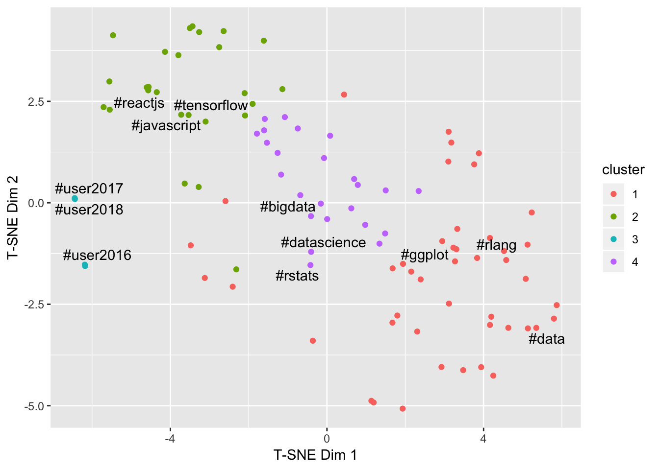
This is pretty cool - the clusters sort of make sense! The UseR! conferences have formed a cluster, non-R languages (Tensorflow, ReactJS, Javascript) have formed a cluster, and the the other two clusters seem to contain all of the popular long-term hashtags.
Time series hashtag profiles
The first plot presented in the original paper looks like this:
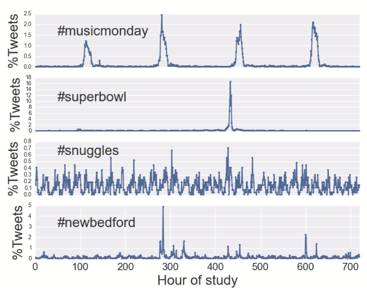
This looks like it has come straight out of ggplot2! We can recreate this as a function in R, and use it to understand differences in temporal patterns between hashtags from different clusters.
hashtag_profile <- function(hashtags, ht_filter, start_date, end_date) {
  hashtags %>%
    filter(name %in% ht_filter) %>%
    filter(timestamp >= as.Date(start_date)) %>%
    filter(as.Date(timestamp) <= as.Date(end_date)) %>%
    mutate(hours = floor(as.numeric(difftime(timestamp,
                                    as_datetime(ymd(start_date)),
                                    units = "hours")))) %>%
    count(name, hours) %>%
    complete(name, hours, fill = list(n = 0)) %>%
    ggplot(aes(x = hours, y = n)) +
    geom_line(col = "red") +
    facet_grid(rows = vars(name), scales = "free") +
    labs(title = "Hashtag Profiles",
         x = "Hours", y = "Tweets per Hour")
}

hashtag_profile(hashtags, c("#rstats", "#tensorflow", "#ggplot", "#user2018"),
                start_date = "2016-01-01", end_date = "2018-07-31")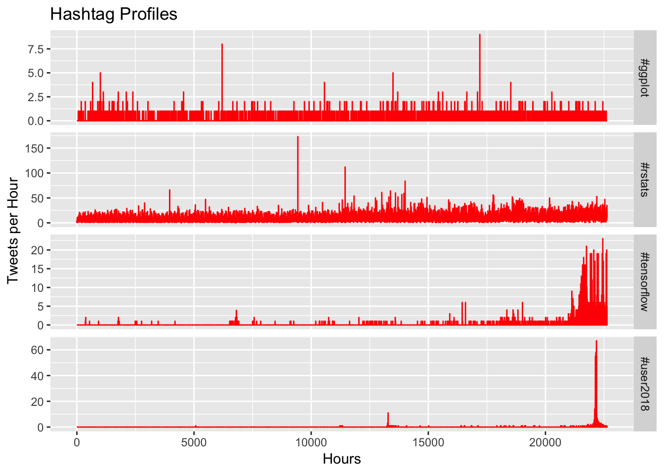
This is a bit less exciting than the clustering result, as the main differences between the top two profiles seem to be limited to the overall volume, but #tensorflow and #user2018 both have different types of explosions of engagement. If we zoom in on July 2018 we might be able to see a bit more detail around the difference in profile.
hashtag_profile(hashtags, c("#rstats", "#tensorflow", "#ggplot", "#user2018"),
                start_date = "2018-07-01", end_date = "2018-07-31")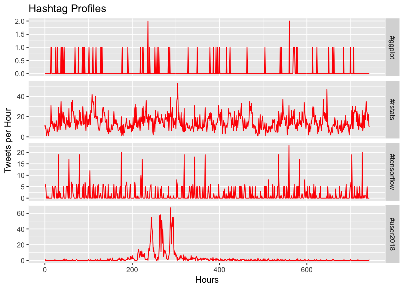
Now we can see that ##ggplot doesn’t really have any discernible pattern, #rstats has a very clear repeating pattern (likely due to time of day), #tensorflow shows a spike every couple of days, and then #user2018 has a remarkably strong daily repeating pattern during the conference.
Community Metrics
In addition to identifying different hashtag usage patterns, the paper sought to understand the implications of such a clustering for communities. The paper proposes two measures: engagement and diversity.
To match the paper as closely as possible, engagement will be defined as the proportion of tweets (with a specified hashtag) that have received a like, a retweet, or a reply.
engagement <- tweets %>%
  filter(!str_detect(text, "nintendo")) %>%
  mutate(engaged = if_else(likes + replies + retweets > 0, "Yes", "No")) %>%
  unnest_tokens(word, text, "tweets") %>%
  filter(str_detect(word, "^#")) %>%
  select("tweet-id", "word", "timestamp", "engaged") %>%
  rename(tweet = "tweet-id",
         name = "word") %>%
  distinct() %>%
  count(name, engaged) %>%
  spread(engaged, n, fill = 0) %>%
  mutate(Engagement = Yes / (Yes + No)) %>%
  select("name", "Engagement")

engagement
## # A tibble: 61,695 x 2
## name Engagement
## <chr> <dbl>
## 1 #a 0.364
## 2 #a11y 0.833
## 3 #a2council 1
## 4 #a3pgcon2016pictwittercomdq55xrnz7i 1
## 5 #a3sr 1
## 6 #a8a8a8 0
## 7 #a8tzzukpfq3wnq8pictwittercomhpao8e9anc 1
## 8 #aaa2018dc 1
## 9 #aaaaaaaaaaayyyyyyyyyyyyeeeeeeeeee 0
## 10 #aaaarrrrghhhh 1
## # ... with 61,685 more rowsDiversity will be defined as the number of unique users who tweet with the hashtag, normalised by the number of tweets for that hashtag.
diversity <- tweets %>%
  filter(!str_detect(text, "nintendo")) %>%
  unnest_tokens(word, text, "tweets") %>%
  filter(str_detect(word, "^#")) %>%
  select("tweet-id", "user", "word", "timestamp") %>%
  rename(tweet = "tweet-id",
         name = "word") %>%
  distinct() %>%
  group_by(name) %>%
  summarise(Diversity = length(unique(user)) / n())

diversity
## # A tibble: 61,695 x 2
## name Diversity
## <chr> <dbl>
## 1 #a 0.364
## 2 #a11y 0.667
## 3 #a2council 0.5
## 4 #a3pgcon2016pictwittercomdq55xrnz7i 1
## 5 #a3sr 1
## 6 #a8a8a8 1
## 7 #a8tzzukpfq3wnq8pictwittercomhpao8e9anc 1
## 8 #aaa2018dc 1
## 9 #aaaaaaaaaaayyyyyyyyyyyyeeeeeeeeee 1
## 10 #aaaarrrrghhhh 1
## # ... with 61,685 more rowsThese metrics can now be joined and used to dig a little deeper. Using the clusters from above, what is the distribution of engagement and diversity?
add_labels <- results %>%
  group_by(cluster) %>%
  top_n(1, volume) %>%
  pull(hashtag)

results %>%
  left_join(engagement, by = c("hashtag" = "name")) %>%
  left_join(diversity, by = c("hashtag" = "name")) %>%
  mutate(label = if_else(
    condition = Diversity %in% c(min(Diversity), max(Diversity)),
    true = hashtag,
    false = "")) %>%
  mutate(label = if_else(
    condition = Engagement %in% c(min(Engagement), max(Engagement)),
    true = hashtag,
    false = label)) %>%
  mutate(label = if_else(
    condition = Diversity + Engagement == max(Diversity + Engagement),
    true = hashtag,
    false = label)) %>%
  mutate(label = if_else(hashtag %in% add_labels, hashtag, label)) %>%
  ggplot(aes(x = Engagement, y = Diversity, label = label)) +
  geom_point(aes(col = cluster)) +
  ggrepel::geom_text_repel(show.legend = FALSE)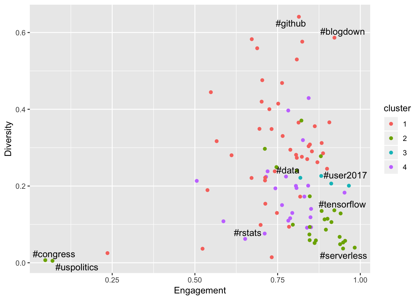
This raises a few interesting observations. Firstly, #rstats has very low diversity! The paper actually identified this phenomenon - the intuition seems to be that a tight community is a strong community. It is also interesting to see the UseR conference hashtag cluster has much higher diversity (in an earlier blog post I showed that these conferences bring many new users to the R Twitter community), and also higher engagement - likely due to the fact that everyone at the conference is already in the mood for engagement.
The really interesting discovery here is the #github and #blogdown hashtags, which appear to be nailing it on both the engagement and diversity fronts, are actually ranked 99 and 100 respectively for overall tweet volumes. Let’s unpick this a little bit.
results %>%
  left_join(engagement, by = c("hashtag" = "name")) %>%
  left_join(diversity, by = c("hashtag" = "name")) %>%
  select(hashtag, volume, Diversity, Engagement) %>%
  gather(measure, value, -hashtag, -volume) %>%
  ggplot(aes(x = volume, y = value, col = measure, alpha = volume)) +
  facet_wrap("measure") +
  theme(legend.position = "none") +
  geom_point()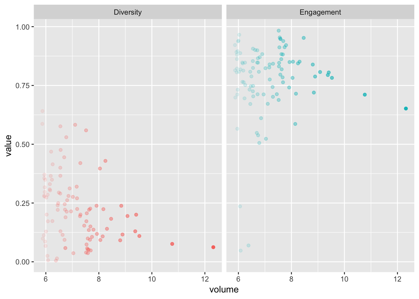
There is a definitely a trend towards lower diversity and engagement as the overall tweet volume increases.
Network Metrics
For my next trick, I’m going to overlay the clusters and the community metrics on the graphs from the previous blog post. I won’t show all of the code for this as it is all covered in the previous blog post and there will be a lot of duplication.
Network and Clusters
In the previous post I looked for communities in the network, but this time I will apply the clusters learned from the sequential hashtag features. I don’t expect to see any patterns here, but it’s worth a try!
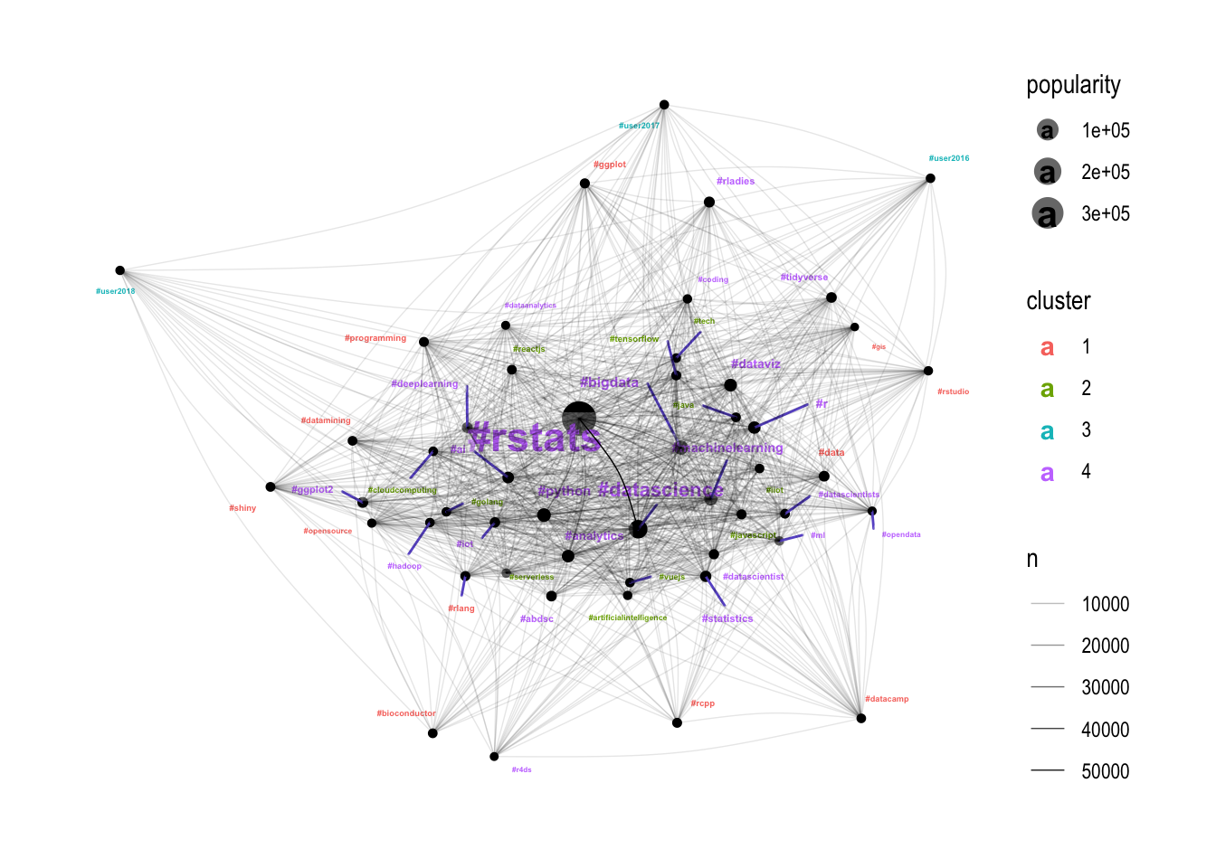
Well I guess there is something in it! The purple cluster (4) seems to be the most well-connected, closely followed by the green cluster (2). The red cluster (1) seems to be picking up the edges of the network (tighter communities), and the blue cluster (3) seems to be entirely made up of conferences which are right on the edge of the graph. Let’s dig further using engagement and diversity.
Network Engagement
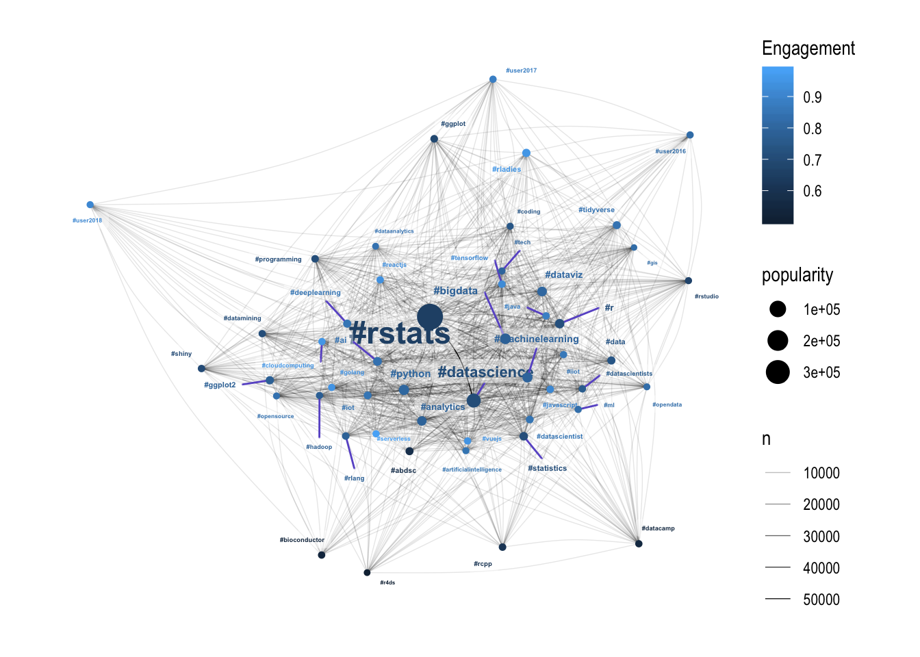
Broadly, the more engaging hashtags are towards the edge of the hairball, meaning that they are less connected with the other hashtags. Thinking of hashtags as communities this sort of makes sense - if your community is unique and separate to the central hairball of communities, then it makes sense that the members of that community are more likely to be strongly engaged.
Network Diversity
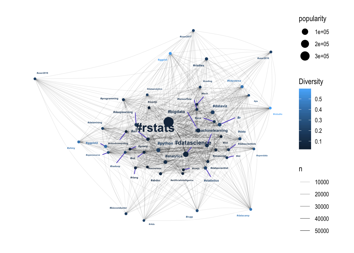
The pattern isn’t as strong here, but the hashtags with high diversity are all towards the edge of the hairball. This suggests that the core of the R community is driven by a small number of people generating a lot of content, with more diverse communities around the edges. Potentially these diverse communities on the edge are acting as entry-points into the broader R Twitter community? I might have to leave that one for another blog post.
Conclusion
I’ve covered a lot of ground here, and without a hypothesis I’ve just been following my nose to see what I can find. I think the key finding from this post is the success of the unsupervised clustering in identifying the conference hashtags, and the fact that clusters based on time-series features are correlated to the connectedness of the network - that was unexpected! The nature of engagement and diversity was also unexpected - I never would have considered that the success of #rstats was potentially boosted by low diversity.
I will of course synthesise some of these findings at the end of the project.